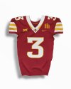
Iowa State Uniform Discussions

t-noah

Well-Known Member
Feb 2, 2007
17,031
10,805
113
Since when are you on the 49ers jersey bandwagon? Yuck. That Breece combo is awful with the white hemet, no white on the pants. KU font on the numbers? What happened to t-noah?
Well, I'm not that good with photoshop yet, that I can just change colors and add stripes, easily. So I took an old image I did last year. The 1D mocks are easy to change color.

I didn't have a font that I liked, similar to ours now, so I went with this one. It can be changed. It never dawned on me that they might look like Kansas' numbers. Maybe they do, doh!

And yes, the gold I used here is a 'little' closer to the 49er gold, but still, I thought, very Cyclone, historically. It can be changed easily. I'll brighten it up some next time for you.

This is why I like the feedback from CF. It usually pushes me into a more balanced direction.
 

t-noah

Well-Known Member
Feb 2, 2007
17,031
10,805
113
What makes you think they are going with a white collar?
ISU UNI 2024 1 @joesummers.jpg I hope they wouldn't do this, but the shoulder stripe looks kind of 'official', coming from ISU Football, so...

This image came from Joe Summers, and I'm not sure who he is really, other than he has an interest in design. The white collar would not be a good look. But then again, I don't like the white and yellow shoulder stripes either.
 

SolarGarlic

Well-Known Member
Jan 18, 2016
5,727
8,561
113
View attachment 127840 I hope they wouldn't do this, but the shoulder stripe looks kind of 'official', coming from ISU Football, so...

This image came from Joe Summers, and I'm not sure who he is really, other than he has an interest in design. The white collar would not be a good look. But then again, I don't like the white and yellow shoulder stripes either.
The shoulder stripes are official, but Summers' mocks are just his ideas using the stripes.
 

SolarGarlic

Well-Known Member
Jan 18, 2016
5,727
8,561
113
How are people so confused on this? They gave us a small snippet of the new jerseys in the April 1 tweet. CW and JP have both confirmed these jerseys are coming for this year.

We don't know anything other than there will be stripes on the shoulders, and we can see the color of the numbers on the shoulders. You could maybe use the style of the numbers and apply it to the rest of the jersey if you wanted to figure out the rest. We know nothing about what the pants will look like.

The Summers mockups were just one guy's take on what could be coming. I don't think he has the numbers right based on the shoulder numbers font style.
 

t-noah

Well-Known Member
Feb 2, 2007
17,031
10,805
113
The shoulder stripes are official, but Summers' mocks are just his ideas using the stripes.
That was my conclusion also, I had hoped anyway. It will be interesting to see the full reveal.

And as far as the black, I think they are making a mistake by largely taking out the silver. We'll see.
 

t-noah

Well-Known Member
Feb 2, 2007
17,031
10,805
113
How are people so confused on this? They gave us a small snippet of the new jerseys in the April 1 tweet. CW and JP have both confirmed these jerseys are coming for this year.

We don't know anything other than there will be stripes on the shoulders, and we can see the color of the numbers on the shoulders. You could maybe use the style of the numbers and apply it to the rest of the jersey if you wanted to figure out the rest. We know nothing about what the pants will look like.

The Summers mockups were just one guy's take on what could be coming. I don't think he has the numbers right based on the shoulder numbers font style.
Agreed. I kind of think they want us to be confused. They want to tease us. It garners interest and anticipation.

I am very interested in how the white and yellow sleeve stripes fit in. I have a hard time believing they might do this now, after 6 years of no white in the unis whatsoever.

Also very interested to see if the new black version will be as good as the old. If it ain't broke, don't, you know. :)
 

SolarGarlic

Well-Known Member
Jan 18, 2016
5,727
8,561
113
Agreed. I kind of think they want us to be confused. They want to tease us. It garners interest and anticipation.

I am very interested in how the white and yellow sleeve stripes fit in. I have a hard time believing they might do this now, after 6 years of no white in the unis whatsoever.

Also very interested to see if the new black version will be as good as the old. If it ain't broke, don't, you know. :)
You have a hard time believing that we would get new jerseys after 6 years? And you think they purposely showed us a preview of the jerseys with white stripes and numbers only to not use them?

You are making this way too complicated. No athletic department is going to tease new jerseys, show part of the new design, tell the fans that we're getting new jerseys, and then switch up the design.
 

t-noah

Well-Known Member
Feb 2, 2007
17,031
10,805
113
You have a hard time believing that we would get new jerseys after 6 years? And you think they purposely showed us a preview of the jerseys with white stripes and numbers only to not use them?

You are making this way too complicated. No athletic department is going to tease new jerseys, show part of the new design, tell the fans that we're getting new jerseys, and then switch up the design.
You are embellishing what I said or what I meant. I do not have a hard time believing that we are getting new uniforms. I have seen the partial release. I have heard what JP and CW have said, that it was no April fools. I do not believe they will switch up the design.

I did comment that I found it hard to believe that they would go with this much white (addition) after 6 years of not having any. That's all. And I commented that I think it will be too much. We'll see.

I also commented that it might be just fine when we see it fully. But right now I am skeptical as to liking it or not.

You seem to fully embrace it? You put words in my mouth, I will do the same to you. You like the white numbers? I also think that could be a good change, but I need to see the full reveal. You like the new shoulder stripes? Me, not so much. Yes, I guess I am making this more complicated. It's what I do (like it or not).
 

t-noah

Well-Known Member
Feb 2, 2007
17,031
10,805
113
Uniforms are fun and frustrating. More fun when you like 'em, frustrating when you don't. In the big picture, they are not that important. But we can talk and speculate.

It does seem like we are getting white numbers on the cardinal jersey. Call me skeptical and frustrated here. What I mean by that is this, Campbell appears to not like our current gold. And he has chosen not to have a gold pant or helmet, so far. I don't think he is going to add a gold pant (or helmet) at this point. If he did, I think it would be a mistake. [We need to add a darker gold (the exact shade is debatable) before we do, IMO.]

So if he does add, say a gold helmet or pant (he won't), 50% of our fanbase or more, will not like it and will *itch about it. I will probably be one of them. We will hear the ketchup and mustard analogies all over again.

Now with these new uniforms, he is taking out a large portion of what little bit of gold we have had in the uniform. He is doing this by changing the gold numbers to white, and presumably, not adding gold elsewhere (pant or other) to offset this change. Our gold, which is still one of our primary colors, is becoming less.

We will begin looking more like North Carolina State, Stanford, or Nebraska even. To me, that's not great change.
 

clonedude

Well-Known Member
Apr 16, 2006
30,907
26,127
113
Uniforms are fun and frustrating. More fun when you like 'em, frustrating when you don't. In the big picture, they are not that important. But we can talk and speculate.

It does seem like we are getting white numbers on the cardinal jersey. Call me skeptical and frustrated here. What I mean by that is this, Campbell appears to not like our current gold. And he has chosen not to have a gold pant or helmet, so far. I don't think he is going to add a gold pant (or helmet) at this point. If he did, I think it would be a mistake. [We need to add a darker gold (the exact shade is debatable) before we do, IMO.]

So if he does add, say a gold helmet or pant (he won't), 50% of our fanbase or more, will not like it and will *itch about it. I will probably be one of them. We will hear the ketchup and mustard analogies all over again.

Now with these new uniforms, he is taking out a large portion of what little bit of gold we have had in the uniform. He is doing this by changing the gold numbers to white, and presumably, not adding gold elsewhere (pant or other) to offset this change. Our gold, which is still one of our primary colors, is becoming less.

We will begin looking more like North Carolina State, Stanford, or Nebraska even. To me, that's not great change.

Calm down. Let's wait and see what they look like. I love the move to white numbers myself. Much needed.
 
  • Agree
Reactions: SolarGarlic

Cloned4Life

Well-Known Member
SuperFanatic
SuperFanatic T2
Mar 5, 2006
2,503
1,683
113
Ankeny
Uniforms are fun and frustrating. More fun when you like 'em, frustrating when you don't. In the big picture, they are not that important. But we can talk and speculate.

It does seem like we are getting white numbers on the cardinal jersey. Call me skeptical and frustrated here. What I mean by that is this, Campbell appears to not like our current gold. And he has chosen not to have a gold pant or helmet, so far. I don't think he is going to add a gold pant (or helmet) at this point. If he did, I think it would be a mistake. [We need to add a darker gold (the exact shade is debatable) before we do, IMO.]

So if he does add, say a gold helmet or pant (he won't), 50% of our fanbase or more, will not like it and will *itch about it. I will probably be one of them. We will hear the ketchup and mustard analogies all over again.

Now with these new uniforms, he is taking out a large portion of what little bit of gold we have had in the uniform. He is doing this by changing the gold numbers to white, and presumably, not adding gold elsewhere (pant or other) to offset this change. Our gold, which is still one of our primary colors, is becoming less.

We will begin looking more like North Carolina State, Stanford, or Nebraska even. To me, that's not great change.
I hear ya.

I loved the black collar in Year-1 of the latest "redesign" phase. The initial uniform set was really solid, with lots of good options.

Then, a bunch of people b*tched about the black collar, so they quickly did a new iteration; getting rid of the black collar, and inexplicably making the numbers way bigger. It was a dumb change. Since that 2nd iteration, the uniforms haven't fit as well (which makes no sense because it seems all they did was make the numbers bigger); they look baggy, with odd-fits on different players. Go back and look at Monty/Butler in the initial uniform, which was Purdy's freshman year - perfect fit, perfect sized numbers, really solid overall. Getting rid of the black collar also makes it stupid to wear a black helmet with the Cardinal top/bottom (no, it simply doesn't look as good, or make sense at all as a uniform combo).

This time around? We will see. I am encouraged initially by seeing that the numbers do not have that odd "swirly" design/multi-color tone to them that this latest iteration has. Never understand it - no where else in any sport do we use a design within the font used for the numbers. If they start using a bunch of white, I am open to it.

As for the gold? I go back and forth. I liked the Chizik/USC-esque design, for the most part. It was classic and simple. Where it got dumb was around ~2013, Nike re-did their template and made the shoulder stripes go all the way down past the armpits, and horribly stretched our numbers and made them bigger/taller. Clearly a half-ass "we don't give a sh*t about Iowa State" effort. Looked really, really stupid. Go look at Lazard's senior season - those shoulder stripes are beyond awful. But back to the gold - it's not gold. It's yellow. And too much yellow doesn't look good on a football uniform. As long as their is some yellow as an accent, the uniforms will not at all remotely resemble NC State, Nebraska, Stanford, etc. A little fake-gold goes a long way :)
 
  • Agree
Reactions: SolarGarlic

t-noah

Well-Known Member
Feb 2, 2007
17,031
10,805
113
As for the gold? I go back and forth. I liked the Chizik/USC-esque design, for the most part. It was classic and simple. Where it got dumb was around ~2013, Nike re-did their template and made the shoulder stripes go all the way down past the armpits, and horribly stretched our numbers and made them bigger/taller. Clearly a half-ass "we don't give a sh*t about Iowa State" effort. Looked really, really stupid. Go look at Lazard's senior season - those shoulder stripes are beyond awful. But back to the gold - it's not gold. It's yellow. And too much yellow doesn't look good on a football uniform. As long as their is some yellow as an accent, the uniforms will not at all remotely resemble NC State, Nebraska, Stanford, etc. A little fake-gold goes a long way :)
Thank you for the post. I agree with all your points, and will go back again and look at them/compare. It will probably just frustrate me though because whoever makes these uniform decisions sometimes doesn't know what they are doing or pay attention to some of these details.

And I did like your last 4 sentences. About the 3 mentioned schools, I was exaggerating to make a point.
 
  • Agree
Reactions: Cloned4Life

SolarGarlic

Well-Known Member
Jan 18, 2016
5,727
8,561
113
You are embellishing what I said or what I meant. I do not have a hard time believing that we are getting new uniforms. I have seen the partial release. I have heard what JP and CW have said, that it was no April fools. I do not believe they will switch up the design.

I did comment that I found it hard to believe that they would go with this much white (addition) after 6 years of not having any. That's all. And I commented that I think it will be too much. We'll see.

I also commented that it might be just fine when we see it fully. But right now I am skeptical as to liking it or not.

You seem to fully embrace it? You put words in my mouth, I will do the same to you. You like the white numbers? I also think that could be a good change, but I need to see the full reveal. You like the new shoulder stripes? Me, not so much. Yes, I guess I am making this more complicated. It's what I do (like it or not).
I guess I'm just confused how your first two paragraphs can connect. Maybe I'm taking "find it hard to believe" too literally. Because we don't have to believe. We've seen the white. Are you saying you are surprised they're going with that much white? "Find it hard to believe" is usually used to express skepticism, not surprise.

Yes, I have been hoping for white numbers and more white on the home jersey in general. I've said for years that our cardinal/gold combo is just not an attractive color combo without white to break it up. I don't think the shoulder stripes are a grand slam, but I do like them. I'm more excited about the white numbers.
 
  • Like
Reactions: t-noah

SolarGarlic

Well-Known Member
Jan 18, 2016
5,727
8,561
113
I hear ya.

I loved the black collar in Year-1 of the latest "redesign" phase. The initial uniform set was really solid, with lots of good options.

Then, a bunch of people b*tched about the black collar, so they quickly did a new iteration; getting rid of the black collar, and inexplicably making the numbers way bigger. It was a dumb change. Since that 2nd iteration, the uniforms haven't fit as well (which makes no sense because it seems all they did was make the numbers bigger); they look baggy, with odd-fits on different players. Go back and look at Monty/Butler in the initial uniform, which was Purdy's freshman year - perfect fit, perfect sized numbers, really solid overall. Getting rid of the black collar also makes it stupid to wear a black helmet with the Cardinal top/bottom (no, it simply doesn't look as good, or make sense at all as a uniform combo).

This time around? We will see. I am encouraged initially by seeing that the numbers do not have that odd "swirly" design/multi-color tone to them that this latest iteration has. Never understand it - no where else in any sport do we use a design within the font used for the numbers. If they start using a bunch of white, I am open to it.
I agree
As for the gold? I go back and forth. I liked the Chizik/USC-esque design, for the most part. It was classic and simple. Where it got dumb was around ~2013, Nike re-did their template and made the shoulder stripes go all the way down past the armpits, and horribly stretched our numbers and made them bigger/taller. Clearly a half-ass "we don't give a sh*t about Iowa State" effort. Looked really, really stupid. Go look at Lazard's senior season - those shoulder stripes are beyond awful. But back to the gold - it's not gold. It's yellow. And too much yellow doesn't look good on a football uniform. As long as their is some yellow as an accent, the uniforms will not at all remotely resemble NC State, Nebraska, Stanford, etc. A little fake-gold goes a long way :)
I agree on almost all of this, especially the size of the numbers and the fit of our current jersey. Most of the time you can't read the linemans' jerseys because of the size, font style, and tight fit. The smaller numbers on the first new set were sharp.
 

Sigmapolis

Minister of Economy
SuperFanatic
SuperFanatic T2
Aug 10, 2011
25,054
37,177
113
Waukee
The spring game made me miss our gold pants even more.

I get it. Campbell doesn't like the color.

Fine. No need for a gold helmet or gold jersey. I'm glad TJ likes them for BB, at least.

But... the gold pants would look so much better than the white ones with the home cardinal jersey and would be a good 1-2 times per season changeup with the road look. I think C/W/C obviously looks the best on the road, though going something like C/W/G against a red team like UH or Tech would work.

Alas, I don't think they're coming, but it was nice to see them again.
 

Help Support Us

Become a patron