Iowa State Uniform Discussions (update: new basketball unis)

k123

Well-Known Member
Sep 14, 2011
1,143
1,033
113
Iowa
Sorry for the bump, but Scheels in WDM has the red replica uniform in stock. I bought one and it’s more t-shirt then it is football jersey. Really thin material, numbers just printed on, not stiched or anything. It’s a pretty big drop in quality over last year’s from what I can tell. Also, there is no logo on the collar.

The "t-shirt jersey" has become more common lately as a cheaper option (below both replica and authentic options) see this link below. Do you think it's intentionally a T-shirt option, or do you think this supposed to be "the replica jersey" and its just become lower quality?
https://www.nflshop.com/Mens_Philad...4nfl-pla&sku=8148675&targetid=pla-72891509069
 

cyhiphopp

Moderator
Staff member
Jan 9, 2009
33,276
14,551
113
Ankeny
Sorry for the bump, but Scheels in WDM has the red replica uniform in stock. I bought one and it’s more t-shirt then it is football jersey. Really thin material, numbers just printed on, not stiched or anything. It’s a pretty big drop in quality over last year’s from what I can tell. Also, there is no logo on the collar.

I'm wondering if they don't have the "authentic" style replica jerseys yet, so they are going with the t-shirt ones.
 
  • Like
Reactions: CascadeClone

CyGuy5

Well-Known Member
Dec 4, 2013
7,881
10,201
113
Kansas City
The "t-shirt jersey" has become more common lately as a cheaper option (below both replica and authentic options) see this link below. Do you think it's intentionally a T-shirt option, or do you think this supposed to be "the replica jersey" and its just become lower quality?
https://www.nflshop.com/Mens_Philad...4nfl-pla&sku=8148675&targetid=pla-72891509069

It’s not actually a t-shirt, but it is much closer to one. I think this is a cheaper attempt at a replica jersey. It almost feels like a soccer jersey. Hopefully there is a better option coming

I'm wondering if they don't have the "authentic" style replica jerseys yet, so they are going with the t-shirt ones.

I was wondering that too and I think you are right. Pretty sure I wasted $75 (not a ton but still). On Cy’s Locker Room it calls it a “legend” jersey. My guess is that the “legend” stands for cheap and they have better ones on the way, but not in time for the season to start.
 
  • Like
Reactions: cyhiphopp

dawgpound

Retired Billy the Barnstormer
SuperFanatic
SuperFanatic T2
Jun 18, 2011
496
599
93
Des Moines, iowa
  • Informative
Reactions: k123

ZB4CY

Well-Known Member
Dec 17, 2012
2,807
4,526
113
Personally I would rather look like USC than the Iowa Hawkeyes. What's with black anyway? Next their going to want to put a gold Hawk on the helmet. Stick with the school colors.

This made me laugh. I really hope it was sarcastic. I laughed as if it were sarcastic.

Wait, you're serious?
 

t-noah

Well-Known Member
Feb 2, 2007
19,780
13,417
113
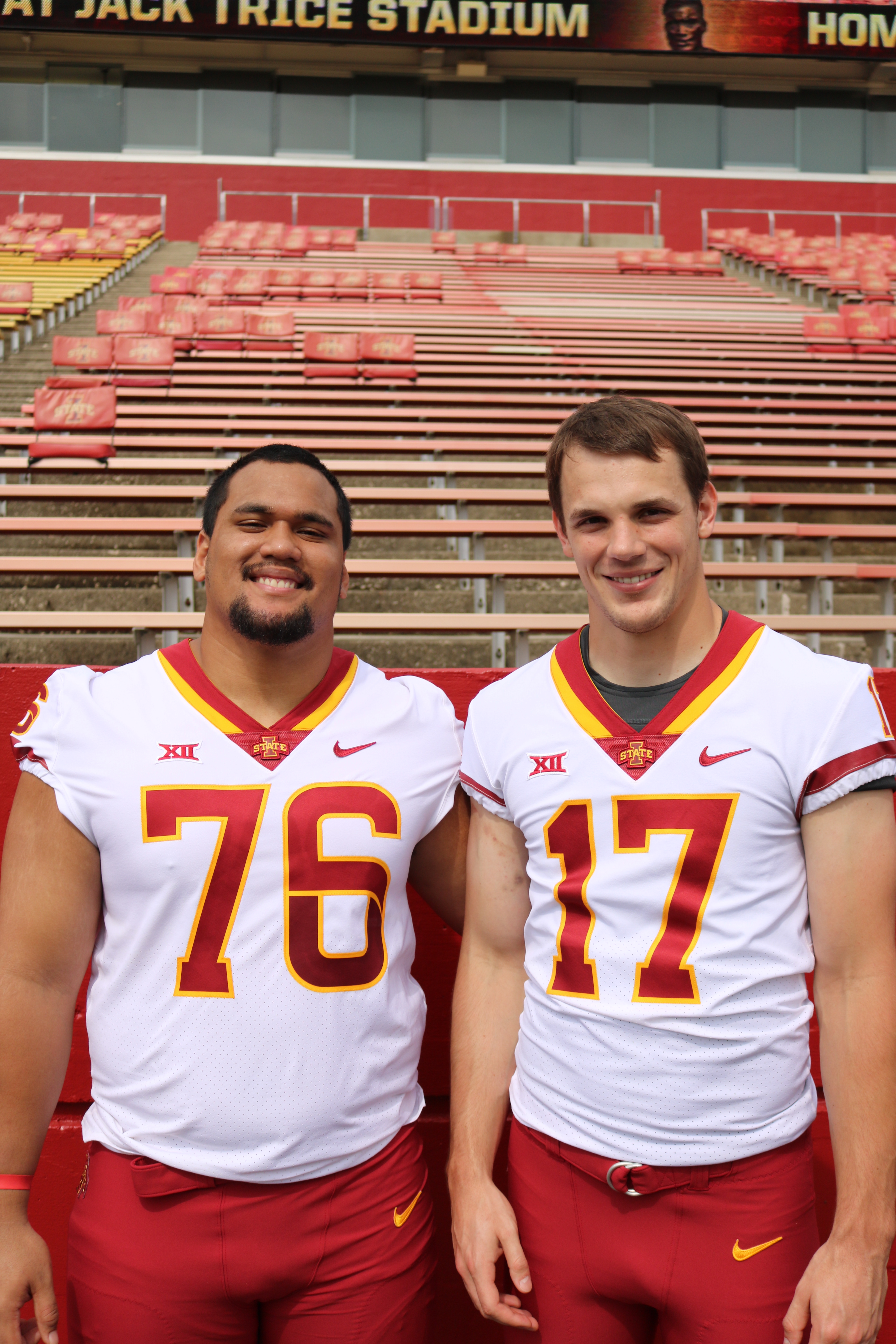
I'm looking to make some posters that use the new uniform numbers. Anyone know how I can get the font?

This is the closest I have found in Word:

AR DESTINE
Bauhaus 93
Am I the only one who thinks the new Font is great? Not speaking to you necessarily Cycsk, but people who have commented seem to be negative about it and I don't know why. I love it.
 

NetflixAndClone

Well-Known Member
Sep 6, 2015
5,634
7,458
113
The State of Hockey
Personally I would rather look like USC than the Iowa Hawkeyes. What's with black anyway? Next their going to want to put a gold Hawk on the helmet. Stick with the school colors.
giphy.gif
 

BMWallace

Well-Known Member
SuperFanatic
Sep 11, 2011
1,538
2,920
113
Chicago, IL
Am I the only one who thinks the new Font is great? Not speaking to you necessarily Cycsk, but people who have commented seem to be negative about it and I don't know why. I love it.
For the most part, its a cool idea. There are a few of the numerals specifically that seem hard to integrate the twist/swoosh into. Like 1 and 7 dont have any sort of swirl or swoosh, so they look a little weird with the rest of the numbers. But the worst is the 6. The flat on the left side just looks bad. I dont know why it doesnt have the curvature to match the other digits.
IMG_0387.jpg
IMG_0381.JPG
IMG_0427.JPG
 

Sigmapolis

Minister of Economy
SuperFanatic
SuperFanatic T2
Aug 10, 2011
26,965
41,694
113
Waukee
They would just look better without the extra yellow lines.

Football uniforms do not need one of these...

A2DB9A50-B1E9-4E17-BCD66E2868133563.jpg


...as a design element.
 
  • Agree
Reactions: CYCLNST8

t-noah

Well-Known Member
Feb 2, 2007
19,780
13,417
113
For the most part, its a cool idea. There are a few of the numerals specifically that seem hard to integrate the twist/swoosh into. Like 1 and 7 dont have any sort of swirl or swoosh, so they look a little weird with the rest of the numbers. But the worst is the 6. The flat on the left side just looks bad. I dont know why it doesnt have the curvature to match the other digits.
IMG_0387.jpg
IMG_0381.JPG
IMG_0427.JPG
Boy your right. I hadn't noticed that yet being out-of-state. That '6' just doesn't look right. Wonder why they did that one that way. Hopefully it wont' be that noticeable. Other than that they're great, IMO.
 

k123

Well-Known Member
Sep 14, 2011
1,143
1,033
113
Iowa
I think you meant to call it "shirsey"

They've been around for baseball forever, it seems strange they are just now (my possible ignorance noted) becoming popular 'affordable' option for football, soccer, etc.
 

k123

Well-Known Member
Sep 14, 2011
1,143
1,033
113
Iowa
For the most part, its a cool idea. There are a few of the numerals specifically that seem hard to integrate the twist/swoosh into. Like 1 and 7 dont have any sort of swirl or swoosh, so they look a little weird with the rest of the numbers. But the worst is the 6. The flat on the left side just looks bad. I dont know why it doesnt have the curvature to match the other digits.

Boy your right. I hadn't noticed that yet being out-of-state. That '6' just doesn't look right. Wonder why they did that one that way. Hopefully it wont' be that noticeable. Other than that they're great, IMO.

I'm sure there is a complicated graphic design "we did an origami folding study" explanation, since it is different than the "9" as well.
upload_2018-8-17_15-51-56.png vs upload_2018-8-17_15-51-25.png
 

Attachments

  • upload_2018-8-17_15-50-21.png
    upload_2018-8-17_15-50-21.png
    5.2 KB · Views: 4
  • upload_2018-8-17_15-50-58.png
    upload_2018-8-17_15-50-58.png
    29.2 KB · Views: 3
  • Funny
Reactions: t-noah

cyclones500

Well-Known Member
Jan 29, 2010
38,865
26,904
113
Michigan
basslakebeacon.com
I like the cyclone-twist effect on the numerals, but it didn't occur to me it doesn't work with all numbers. Examples in The Reveal included 2 and 3, where it obviously works, but 1 and 7 have no place to apply it. Not a big deal, it's only a subtle detail of the full design anyway, worth a try for creativity.
 

Latest posts

Help Support Us

Become a patron