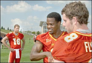
It's a new model that Riddell rolled out last year I think. I'm pretty sure players get to choose which style helmet they use from a few options.Interesting looking helmet... is that some new design?

No forums found...
Site Related
Iowa State
College Sports
General - Non ISU
CF Archive
Install the app
Iowa State Uniform Discussions (update: new basketball unis)
- Thread starter CyTwins
- Start date
No forums found...
Site Related
Iowa State
College Sports
General - Non ISU
CF Archive
You are using an out of date browser. It may not display this or other websites correctly.
You should upgrade or use an alternative browser.
You should upgrade or use an alternative browser.


My one takeaway is that we’re still on the old Nike template. I assume that should come next year along with a possible refresh
Maybe next year - although this template has been around for a while, it's only widely available this year - frankly, I prefer the Untouchable template, specifically the collar & less seams including no seams on the frontMy one takeaway is that we’re still on the old Nike template. I assume that should come next year along with a possible refresh
Here's a look at the, side-by-side:
Wow! The uniform thread has drifted three pages back on the forums list.
About time to re-awaken it with what the uniforms for the Cy-Hawk game are going to be?...
About time to re-awaken it with what the uniforms for the Cy-Hawk game are going to be?...
White helmet w/ cardinal facemaskWow! The uniform thread has drifted three pages back on the forums list.
About time to re-awaken it with what the uniforms for the Cy-Hawk game are going to be?...
Cardinal jersey
White pants
I sure hope so. I think the W/C/W combo is sharp, probably the bast home uni combo we have.White helmet w/ cardinal facemask
Cardinal jersey
White pants
Wow! The uniform thread has drifted three pages back on the forums list.
Mostly because it turned into a combination fan-fic and miscellaneous (non-ISU) uniform thread.
Is that official, or your prediction/preference?White helmet w/ cardinal facemask
Cardinal jersey
White pants
One thing I really don't like as someone who only gets to watch from home, and the quality of ESPN+ doesn't help, but the numbers font is really annoying as some numbers can easily be confused for one another, especially if a jersey bunches up. The way the tail of the 5 comes almost all the way up makes it look like a 6 at times. I know I should be able to tell Sanders and Norton apart by their body type, but it is hard to tell on tv, especially early in the season when they are rotating in so frequently. Is this just a me problem, or do others feel the same way?


There is some confusion for me on the DL because they are the most likely to have their jerseys bunch up. But I mostly just think the number font is ugly. Too big, too busy.One thing I really don't like as someone who only gets to watch from home, and the quality of ESPN+ doesn't help, but the numbers font is really annoying as some numbers can easily be confused for one another, especially if a jersey bunches up. The way the tail of the 5 comes almost all the way up makes it look like a 6 at times. I know I should be able to tell Sanders and Norton apart by their body type, but it is hard to tell on tv, especially early in the season when they are rotating in so frequently. Is this just a me problem, or do others feel the same way?
View attachment 116452
One thing I really don't like as someone who only gets to watch from home, and the quality of ESPN+ doesn't help, but the numbers font is really annoying as some numbers can easily be confused for one another, especially if a jersey bunches up. The way the tail of the 5 comes almost all the way up makes it look like a 6 at times.
It's not much better in person.
But it's been that way in multiple uniform sets. The 2003-07 Nike jerseys were almost impossible to differentiate 0, 3, 6, 8, and 9 if the jersey shifted even a little.
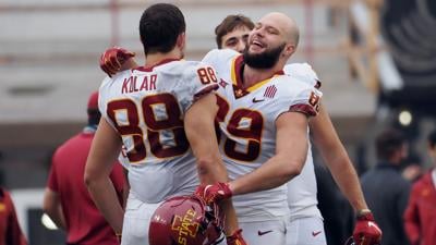
If you didn't know that Nik Moser wore #9, you might think he was wearing #8 here:

Cris Love? That's #16 (not #18):
The main problems with the current sets are the narrow gaps (such as the 5) and the stylized interior of the numbers. For example, the design of the 8 almost makes it looks like a 9, given the small gap in the 9. See Kolar and Soehner:
I am fairly certain that some coaches like that the numbers can be harder to read. Set up position groups with similar looking numbers so that opposing teams have a harder time immediately recognizing personel and packages. Just a bit of gamesmanship.It's not much better in person.
But it's been that way in multiple uniform sets. The 2003-07 Nike jerseys were almost impossible to differentiate 0, 3, 6, 8, and 9 if the jersey shifted even a little.
If you didn't know that Nik Moser wore #9, you might think he was wearing #8 here:
Cris Love? That's #16 (not #18):
The main problems with the current sets are the narrow gaps (such as the 5) and the stylized interior of the numbers. For example, the design of the 8 almost makes it looks like a 9, given the small gap in the 9. See Kolar and Soehner:


My father told me he heard they are going C/C/W again, but I don't know where he got that information.
Yes, that is the bird I was thinking of! Thanks for the up close comparison! Close enough for me. LOL.
That is my unofficial prediction.Is that official, or your prediction/preference?
If we're going to go C/C again we need to just go all cardinal.My father told me he heard they are going C/C/W again, but I don't know where he got that information.
Did they get permission from Iowa?
Some hawk fans still say that this is not a trend across the country.