


I just found out that college football starts next month, so I have been perusing literature regarding the Iowa Agriculture College team. I look forward to our bowl game this year. However, I saw something that profoundly disturbed me. Haven't been able to sleep.
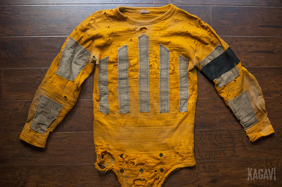
First, let's look at the original Jack Trice patch, which has the correct design of the stripes being the opposite color of the jersey, matching the jersey number color. This has the effect of highlighting the stripes as prominently seen on Jack Trice's jersey in 1923. Beautiful. Timeless. Meaningful.

For some reason the new patch is reversing that, meaning the stripes are now the same color as the jersey while the patch background is the opposite color. This means the majority of the patch is now the background color. Now it looks like the side profile of a house as drawn by a child and the 1923 jersey design melts into the background. From a distance, it looks almost like a solid yellow shape.
From a very general historical design stand point, this also makes it less accurate to Jack Trice's day. I fear the same has happened with the away jerseys.
WHYYYYYYYYYYYYYYYYYYYYYY
Since I assume the jerseys will now have an enormous green MONSTER "M" somewhere, a large Hickory Park advertisement, two other smaller patches from perhaps Brown's Shoe Fit and The Pumpkin Patch, maybe the Trice patch should be moved somewhere else. I've never liked it above the face mask either. Let's rethink it all.
In the past, I've created concepts that placed the stripes in their original Jack Trice era size behind the jersey numbers in a slightly different shade than the base jersey color for a subtle touch. I also dressed the Football Cy logo in his own exact replica Jack Trice jersey. I'm sure there's other ideas out there.
Also renewing my call for an annual Jack Trice "uniform" game, which would typically be just a different helmet (AMES, many other ideas), then every 5 years roll out a different retro-inspired uniform.
Of course, never forget:
First, let's look at the original Jack Trice patch, which has the correct design of the stripes being the opposite color of the jersey, matching the jersey number color. This has the effect of highlighting the stripes as prominently seen on Jack Trice's jersey in 1923. Beautiful. Timeless. Meaningful.
For some reason the new patch is reversing that, meaning the stripes are now the same color as the jersey while the patch background is the opposite color. This means the majority of the patch is now the background color. Now it looks like the side profile of a house as drawn by a child and the 1923 jersey design melts into the background. From a distance, it looks almost like a solid yellow shape.
From a very general historical design stand point, this also makes it less accurate to Jack Trice's day. I fear the same has happened with the away jerseys.
WHYYYYYYYYYYYYYYYYYYYYYY
Since I assume the jerseys will now have an enormous green MONSTER "M" somewhere, a large Hickory Park advertisement, two other smaller patches from perhaps Brown's Shoe Fit and The Pumpkin Patch, maybe the Trice patch should be moved somewhere else. I've never liked it above the face mask either. Let's rethink it all.
In the past, I've created concepts that placed the stripes in their original Jack Trice era size behind the jersey numbers in a slightly different shade than the base jersey color for a subtle touch. I also dressed the Football Cy logo in his own exact replica Jack Trice jersey. I'm sure there's other ideas out there.
Also renewing my call for an annual Jack Trice "uniform" game, which would typically be just a different helmet (AMES, many other ideas), then every 5 years roll out a different retro-inspired uniform.
Of course, never forget:
Last edited:


