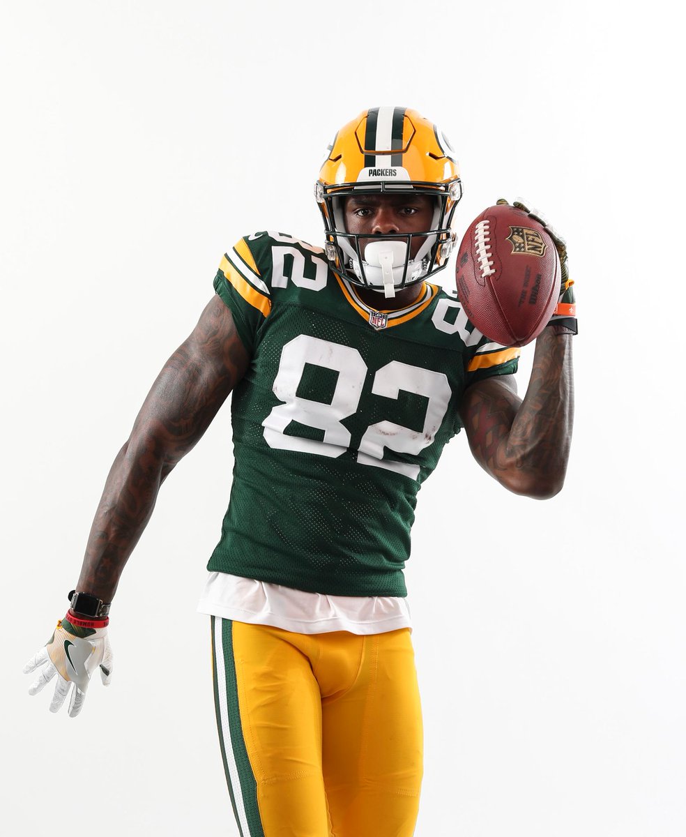
What about a white outline on the numbers? Or white numbers with yellow outline?
I don't think any white is needed...unless they want to pair with the white paints again and not look like the JV squad. Some white on top would better coordinate the tops with the white pants in that case.