Check out this AMAZING Cyclone "tornado" logo concept

TXCyclones

Well-Known Member
SuperFanatic
SuperFanatic T2
Sep 13, 2011
11,191
12,196
113
TX
Based on my personally experience here in TX, I have to agree wholeheartedly. WalkingCy also said a similar thing above. Folks, the I-STATE logo is working.

This this this. I travel nearly every week and have the I-State logo on my bags, phone screen, jacket, etc. I get people nationwide talking to me about ISU, especially basketball. The UT and Aggies grads I work with comment often that they love our colors and logo and wish they would update their own look. Considering these are marketing/advertising professionals I think they're right. I like secondary ideas, but I hope we stay with I-State.
 

amestoplease

Well-Known Member
Jan 30, 2012
289
889
93
LOL. In our defense, the 1920s didn't have the poo emoji. Ha.

Let's not get off path here. No one is suggesting that we use that mock 1920s throwback, but rather amestoplease's concept. Also, no one is advocating getting rid of the I-STATE logo, but rather adding the Cyclone as a secondary logo right next to Cy. Seems logical, right?

After all, look at so many other schools using both a "school" logo and an "iconic" logo:

attachment.php


Many other schools have three logos: the standard school athletic logo, the design logo, and the mascot logo. For example, Arizona State pictured above has the ASU logo, the trident logo, and the sun devil mascot logo.

Right now Iowa State has the I-STATE logo, __________ (no logo for the school nickname), and the Cy mascot logo. Does that make more sense?


well at least one person understands the idea here (kagavi). nobody said replace the I-STATE mark. we dont have a 'mascot' depiction that people embrace and with a name like 'cyclones,' tornadic imagery makes sense. i cant think of many schools that have one primary mark alone and i dont think we should be one of those schools. wanting more 'snarl' is a moot point: the I-STATE mark has snarl? 'people outside the state wont know what it is' is weak because thats what every logo goes thru when its new (think of the new pepsi log, for example). and this isnt even new, im guessing a lot of people can draw the connection to the tornado logo of the 80s. at least its pretty original as far as mascots go because there are about 34,564,547 wildcats, panthers, eagles, tigers, bears (oh my!) sports logos out there that these same 'clueless people outside of the state' would no way ace on a match-the-mascot-to-the-school questionnaire. i designed this for fun and would like to see at least a subtle reincorporation of this element of our mascot and history to our present day identity. something similar is used on the back panel of our basketball jerseys. think of helmet pride stickers (ohio state doesnt use their O-STATE logo, do they?). alternate helmet logo. its an idea of addition, not a replacement.
 

cyhiphopp

Moderator
Staff member
Jan 9, 2009
33,267
14,536
113
Ankeny
This this this. I travel nearly every week and have the I-State logo on my bags, phone screen, jacket, etc. I get people nationwide talking to me about ISU, especially basketball. The UT and Aggies grads I work with comment often that they love our colors and logo and wish they would update their own look. Considering these are marketing/advertising professionals I think they're right. I like secondary ideas, but I hope we stay with I-State.

I hope we never change the primary mark from I-State. But I hate the foghorn leghorn Cy. I want old school walking Cy and a Tornado logo for secondary marks.
 

cyhiphopp

Moderator
Staff member
Jan 9, 2009
33,267
14,536
113
Ankeny
I'd like to see the I-State logo on top of this new and improved cyclone. Anyone nice enough to make that happen for me?
 

Erik4Cy

Well-Known Member
Jan 22, 2007
9,728
932
113
Johnston, IA
www.cyclones.com
I'm cool with a secondary to the primary I-State, but I've always been a walking Cy fan myself. Looks like a ****** off bird on a mission. But I totally get wanting to have something Cyclonic as our logo being that well, we are the Cyclones.
 

amestoplease

Well-Known Member
Jan 30, 2012
289
889
93
This this this. I travel nearly every week and have the I-State logo on my bags, phone screen, jacket, etc. I get people nationwide talking to me about ISU, especially basketball. The UT and Aggies grads I work with comment often that they love our colors and logo and wish they would update their own look. Considering these are marketing/advertising professionals I think they're right. I like secondary ideas, but I hope we stay with I-State.


i think some of you are missing the point. nobody is saying that the I-STATE isnt recognized. nobody is saying that 'it works and people know it but get rid of it!' logos get recognized the longer theyre around and are increasingly more recognized when the teams are good and get attention. did we have a past primary logo that wasnt recognized or something? some people are acting like ever since we got the I-STATE mark, dark corners of the globe NOW know who iowa state is.
 

HFCS

Well-Known Member
Aug 13, 2010
68,471
55,821
113
LA LA Land
well at least one person understands the idea here (kagavi). nobody said replace the I-STATE mark. we dont have a 'mascot' depiction that people embrace and with a name like 'cyclones,' tornadic imagery makes sense. i cant think of many schools that have one primary mark alone and i dont think we should be one of those schools. wanting more 'snarl' is a moot point: the I-STATE mark has snarl? 'people outside the state wont know what it is' is weak because thats what every logo goes thru when its new (think of the new pepsi log, for example). and this isnt even new, im guessing a lot of people can draw the connection to the tornado logo of the 80s. at least its pretty original as far as mascots go because there are about 34,564,547 wildcats, panthers, eagles, tigers, bears (oh my!) sports logos out there that these same 'clueless people outside of the state' would no way ace on a match-the-mascot-to-the-school questionnaire. i designed this for fun and would like to see at least a subtle reincorporation of this element of our mascot and history to our present day identity. something similar is used on the back panel of our basketball jerseys. think of helmet pride stickers (ohio state doesnt use their O-STATE logo, do they?). alternate helmet logo. its an idea of addition, not a replacement.

I didn't mean to disagree with you. It's seeking an answer to the same question that has plagued a multitude of reboots.
I was in ISU's design program shortly after blender-cy...given trends in especially pro sports logos at the time and the always present question of "cardinal that's a cyclone?" many people thought it had been knocked out of the park.

To me the failure of it was 90% in the typography...and then I State is an overcompensation for that mistake, possibly a necessary one. We could replace the oval head cy or muscle looking Cy with the classic walking Cy or your cyclone mark today (as companions to I State) and it would be an improvement in my opinion. All 3 options still have the issue of cyclone vs a bird because you've still got a huge bird patrolling the sidelines.
 

Erik4Cy

Well-Known Member
Jan 22, 2007
9,728
932
113
Johnston, IA
www.cyclones.com
i think some of you are missing the point. nobody is saying that the I-STATE isnt recognized. nobody is saying that 'it works and people know it but get rid of it!' logos get recognized the longer theyre around and are increasingly more recognized when the teams are good and get attention.

This I will give you. In general, yes logos do take time build a "brand" and become recognized more easily.

did we have a past primary logo that wasnt recognized or something?

Some would say that yes, yes we did. At least compared to what we have now (and what we have now we haven't had for nearly as long.)
 
Last edited:

CascadeClone

Well-Known Member
Oct 24, 2009
9,286
11,259
113
I got a tornado logo shirt at dogtown a couple years ago. IDK if they are carrying anything with it currently, but they were in the recent past.

Love the tornado logo, but agree with those who say keep I-State as the primary mark. Use tornado as secondary. And I am ok with the angry bird circle as a second, secondary. It's grown on me.
 

HFCS

Well-Known Member
Aug 13, 2010
68,471
55,821
113
LA LA Land
This I will give you. In general, yes logos do take time build a "brand" and become recognized more easily.


Some would say that yes, yes we did. At least compared to what we have now (and what we have now we didn't have nearly as long.)

I hate dropping the 'i'm a pro' thing, but our whirly bird mark had major issues being recognized. When it had Iowa State or ISU inserted into it it was hard to read, and the versions that were just ISU or just Iowa State were absolutely time stamped 'MID 90s'.

As long as we stick with something like I State and then various solutions for a mark showing a cyclone or Cy the cardinal we won't have serious issues like that again.

Another thing with the whirlybird Cy people overlook is that there was a legitimate issue of color harmony. We had somehow moved toward that primary vibrant yellow and red that was a big problem. They tried to solve it with a navy blue. The current system solves it much better with richer cardinal and gold colors and a deeper red color as a subtle accent. Beyond keeping I State, keeping that progress in the color palette is the other thing I'd deem essential.
 

HFCS

Well-Known Member
Aug 13, 2010
68,471
55,821
113
LA LA Land
If Alabama can have an elephant, I say we can do whatever the hell we want.

And in some cases it can be better than something incredibly contrived. I think we learned that the hard way trying to mash up a bird and a weather storm.
 

NickTheGreat

Well-Known Member
SuperFanatic
SuperFanatic T2
Jan 17, 2012
10,491
4,396
113
Central Iowa
Anything is better than Wisconsin Badger Cy. I refuse to buy things with that one. :realmad:

I do like the tornado, but then again, that was the logo when I was growing up. I-State is awesome, and people do/are recognizing it.
 

CYCLNST8

Well-Known Member
Jul 19, 2008
10,927
12,443
113
Urbandale
www.gimikk.com
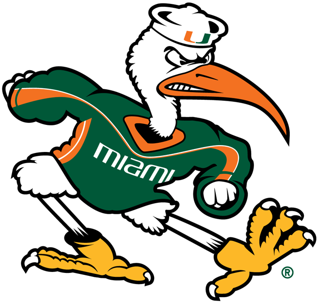
Ya ever wonder if Miami fans have the same discussions? Team name: also a weather phenomenon. Team mascot: also a bird.

5230_miami_hurricanes-wordmark-2000.png

2535.png
gesyqi35d1g4p6t156zh0h7rz.png

What the heck is that 2nd logo??
 
Last edited:

weR138

Well-Known Member
Feb 20, 2008
12,187
5,138
113
Based on my personal experience here in TX, I have to agree wholeheartedly. WalkingCy also said a similar thing above. Folks, the I-STATE logo is working.

There's no reason to scrap the I-STATE logo (although plenty of graphic designers could come in here make a case that that font will become outdated).

My point is that logos like the Longhorn or Powercat do more work themselves. They don't require a color scheme to work. Given the choice I'd guess KSU, MSU, ASU fans would rather have a piece of apparel that showed a Powercat, Spartan Helmet or Pitchfork rather than the word STATE. I'm not saying it has to be the tornado either, removing the STATE from the I would work. We could use a BLOCK I the way Michigan uses their BLOCK M...
 

amestoplease

Well-Known Member
Jan 30, 2012
289
889
93
just to give you an idea of what other big12 schools have as their primary and secondary logos to date. half of these are nowhere to be found in public and im willing to bet some of you didnt even know some of these existed.


attachment.php
 

Attachments

  • big12_mascots.jpg
    big12_mascots.jpg
    186.6 KB · Views: 315

jbhtexas

Well-Known Member
Oct 20, 2006
14,144
4,098
113
Arlington, TX
just to give you an idea of what other big12 schools have as their primary and secondary logos to date. half of these are nowhere to be found in public and im willing to bet some of you didnt even know some of these existed.

So I wonder what the point was of developing a secondary mark if it is ultimately nowhere to be found in public? Just to say you have one?
 

amestoplease

Well-Known Member
Jan 30, 2012
289
889
93
There's no reason to scrap the I-STATE logo (although plenty of graphic designers could come in here make a case that that font will become outdated).

My point is that logos like the Longhorn or Powercat do more work themselves. They don't require a color scheme to work. Given the choice I'd guess KSU, MSU, ASU fans would rather have a piece of apparel that showed a Powercat, Spartan Helmet or Pitchfork rather than the word STATE. I'm not saying it has to be the tornado either, removing the STATE from the I would work. We could use a BLOCK I the way Michigan uses their BLOCK M...


this is exactly what ohio state has tried and it hasnt caught on, probably because it looks naked and, personally, i think its a lot harder to immediately make the connection to ohio state than one might think. it doesnt help that a bunch of other schools have almost the same 'O' so if the future is every school having a single initial mark, count me out. its the least original route we could possibly go and would rely on color scheme alone to differentiate between schools.