i personally think there should be a good balance of cardinal, gold, and white throughout. here's another pipe dream combo:


Nice little April Fools Day uniform prank I suspect:


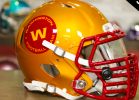
Love this look. Would love to see a gold (yellow) helmet with this. Nice work!
This is the way and will be our best uniform ever. Closer to the Majors era than the 80's. Use a stencil I-State or an 80's CrinerClone with no wordmark above it and we would have a great look to rotate in.Agree on your last paragraph so much. I just don’t think we will get a large variety and I don’t think we are getting a white collar either.
I would say this is the most likely design. Which is still an improvement imo, but less adventurous.
View attachment 126907
Love this look. Would love to see a gold (yellow) helmet with this. Nice work!

having messed with exactly what you're describing i think it starts to look too busy when you try to use the 5 stripes stretched out down the length of the pants. maybe something more subtle like this so the pants don't feel too plain?@amestoplease is CRUSHING it with these last few.
What would it look like with the Trice 5 bar on the shoulder, and 5 matched stripes down the length of the pants? Does that make it look more like a "whole" or is it just weird? Maybe it depends on the colors - if the shoulder bars are gold on cardinal background, then you couldn't have gold pants. Maybe if the bars are white?

Looks like they've made it an official version with black instead of the tertiary blue.Check out that logo they are using on visitors name tags!!!! Love it
What in the absolute ****. Out of all our millions of iterations of logos, that is absolutely 1 or 2 for the worst ever. We waste walking Cy, leaning Cy, sports-specific Cy, scripts, trice 5-bars for that monstrosity?Check out that logo they are using on visitors name tags!!!! Love it
Spitballing here, but I know CMC thinks very highly of Dan McCarney. This is callback to his era, and that’s nostalgic for a sizable chunk of our fanbase too.What in the absolute ****. Out of all our millions of iterations of logos, that is absolutely 1 or 2 for the worst ever. We waste walking Cy, leaning Cy, sports-specific Cy, scripts, trice 5-bars for that monstrosity?
I may have a tendency to overreact to that specific logo. We had season ticket in both MBB and FB when that logo was used so it's not like I'm not used to it. But for some reason I find it absolutely repulsive at my core.Spitballing here, but I know CMC thinks very highly of Dan McCarney. This is callback to his era, and that’s nostalgic for a sizable chunk of our fanbase too.
I’m hoping this opens door for other older (and better) logos in an official capacity.

But for some reason I find it absolutely repulsive at my core.

Hopefully leftovers. That is one of the worst logos in the history of college sports.Check out that logo they are using on visitors name tags!!!! Love it
Agree, the lettering is what killed it (for the most part).This logo isn't as bad.
View attachment 127281
The letters make it too busy and scream bad 90s design.