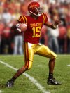
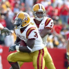
Maybe it’s my age but yikes those are gross. We would get roasted if we rolled out dirty brown mustard pants.View attachment 128666
I like the new unis just fine, but these are the standard and should be recreated.
No forums found...
Site Related
Iowa State
College Sports
General - Non ISU
CF Archive
Install the app
Iowa State Uniform Discussions
- Thread starter CyTwins
- Start date
No forums found...
Site Related
Iowa State
College Sports
General - Non ISU
CF Archive
You are using an out of date browser. It may not display this or other websites correctly.
You should upgrade or use an alternative browser.
You should upgrade or use an alternative browser.
Or... I might be willing to sacrifice the white helmets to have gold ones.I don't think we'll get 4 helmets in the near future (unless we are Oregon). Helmets are pretty expensive and each one has to be custom fitted.
We would have to get rid of the black helmet (not doing with this coach)(and I like the black unis), to add gold. Or go to 4 helmets.
All set for Farmageddon - Ireland edition...Technically we could have green uniforms and it'd be within our primary pallete. For some reason.
Funny at the end where they talk about color combos to avoid:
"Colors associated with other public institutions, such as the one on the eastern side of the state, should not be used. Even though gold is one of Iowa State's primary colors, use of black and gold together should be avoided. Purple is not within any of Iowa State's color palettes and should never be used."
So those black helmets with the i-state logo are prohibited. But this is for the university side more than anything. The athletic department seems to do whatever they want.
Now that's an old school FB stadium and field! And yes, those were good unis, and why we changed colors is pretty unreal, when you think about it.View attachment 128666
I like the new unis just fine, but these are the standard and should be recreated.
Looking at the very good detail of the endzone, it is amazing what the grass must go thru (with all that paint). Had to have about killed it by the end of the year. Look at the red letters of the endzone, one step before dead and gone. LOL
JTS had artificial turf at the time of that picture.Now that's an old school FB stadium and field! And yes, those were good unis, and why we changed colors is pretty unreal, when you think about it.
Looking at the very good detail of the endzone, it is amazing what the grass must go thru (with all that paint). Had to have about killed it by the end of the year. Look at the red letters of the endzone, one step before dead and gone. LOL
It's kinda wild how good these and how easily we could just copy them lol.View attachment 128666
I like the new unis just fine, but these are the standard and should be recreated.
The pant and helmet stripe, chefs kiss
Please explain - that def doesn't look like "astroturf" - what was it?JTS had artificial turf at the time of that picture.
JTS had artificial turf at the time of that picture.
I don't think that's JTS or artificial turf.
JTS had artificial turf at the time of that picture.
That picture is the old Clyde Williams field.
It's Clyde Williams, and late 60's or early 70's based on the uniforms.JTS had artificial turf at the time of that picture.
Clyde W and the 'real' thing.Please explain - that def doesn't look like "astroturf" - what was it?
Obviously the gear would be updated to modern standards. They wouldn't look as dirty and shoddy as the pic. The helmet and the jersey colors are dead on and the pants aren't far off. Mustard is so much better than our bright ass yellow. Those pants are clearly not brown when you look at the matching helmet.Maybe it’s my age but yikes those are gross. We would get roasted if we rolled out dirty brown mustard pants.
Those are the 2nd best pants ever worn behind the initial "old gold" Trice throwbacks. They were awesomeView attachment 128674
The reviews for these babies were all positive. Plus we punked Iowa that day with five field goals. Twas a good day.
When ISU converted to the I-State logo with new unis back then, the initial mockups had replicated these pants but unfortunately when the real ones were revealed, they had the bright gold/yellow. It is hard to understand why Nike couldn't have had exact replicas of these and why ISU didn't demand them.
It was "advertised" as this, correct?When ISU converted to the I-State logo with new unis back then, the initial mockups had replicated these pants but unfortunately when the real ones were revealed, they had the bright gold/yellow. It is hard to understand why Nike couldn't have had exact replicas of these and why ISU didn't demand them.

Yes, that is the pic I was referring to. Thx for posting!
I don’t think they wanted those exact colors — this is just a shopped photo of Bret Meyer from the throwback game against Iowa — Nike could certainly make them (they already had), but that’s not what the school wantedYes, that is the pic I was referring to. Thx for posting!
As posted earlier, ISU should have pushed for those used in that game vs TOE and as depicted in the Meyer photo. Much better look IMO.I don’t think they wanted those exact colors — this is just a shopped photo of Bret Meyer from the throwback game against Iowa — Nike could certainly make them (they already had), but that’s not what the school wanted
Agree, stripe(s), not a white face mask.It is a bit mismatched but the cardinal helmet as a standalone is a good looking helmet in my opinion. I hate white facemasks. It looks like you're wearing a toy helmet. Some white accents on the helmet might work.
I would def not be disappointed if they copied the '77 uniforms (except for the BEAT IOWA jerseys)As posted earlier, ISU should have pushed for those used in that game vs TOE and as depicted in the Meyer photo. Much better look IMO.


