First off.... if this is costing the taxpayers ANYTHING at all to switch plates, then why in the **** are we changing it at all?
But if we are going to change them, then I'm one of those losers out there that likes the first one the best because I prefer a very simple and clean design. I think that one looks sharp, and reminds me of Grant Wood.
The red, white, and blue one just gives the look like "hey everyone, look how patriotic I am!". I had to go check too, because I thought at first it was the Russian Flag, and that would have just been too hilarious. If people want to pay more for a "patriotic" plate, like the state university ones, then fine.
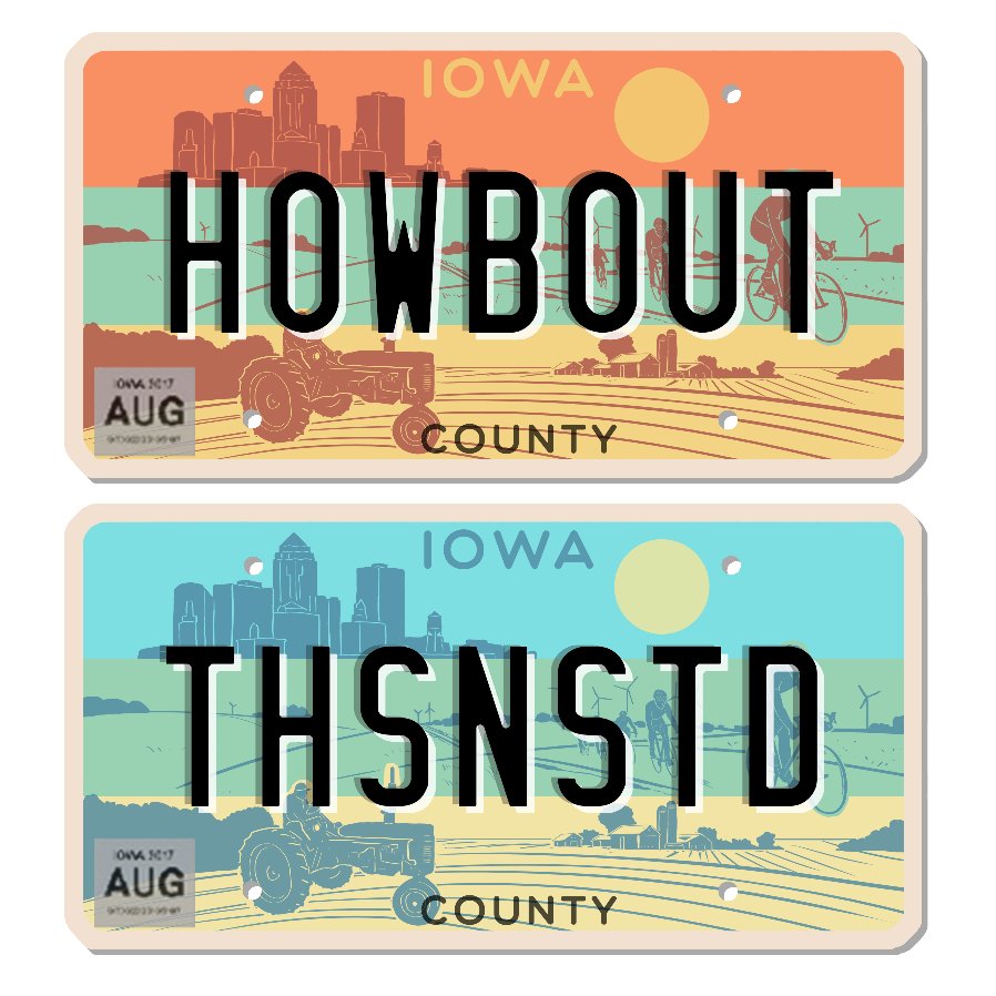
And initially, I really liked the 3rd one the most, but the more I looked at it, I think the top line of the plate should just be "IOWA" only, with no pics. It just looks too busy to me to have the top line have a skyline, then the word "IOWA", and then a wind turbine and a farm too.
Give me the first one with the clean, "boring", sharp look with good colors too IMO.