Iowa State Uniform Discussions (update: new basketball unis)

t-noah

Well-Known Member
Feb 2, 2007
19,780
13,417
113
We've seen cardinal on gold. It looks terrible.
I meant to give you a disagree instead of of dislike, sorry. Both are about the same but I do not like to give out either. Instead I like to be be positive and let people have their opinion. I've had a bunch of dislikes/disgrees in the past. No fun but you learn from it.

It comes to a point where enough is enough though. We are ISU. Our colors are cardinal and gold. Historically both have varied/changed. I've been a Cyclone a long time, very likely longer than you. Maybe if you do not like our colors, go root for another team I don't know. Sorry, I don't really mean that, but... I don't mean to be personal to you SolarGarlic but rather to the many who say similar.

We can argue 'till the sun goes down about the shade of cardinal or gold. It is very subjective. What I don't particularly like is to so quickly slam our current colors and to say they are terrible.
 

t-noah

Well-Known Member
Feb 2, 2007
19,780
13,417
113
Well, yes some of the designs/shades in the past did look bad/too strong, or whatever. I'll be the first to agree. This design does not do that, IMO... whatever shade.

Unlike @Sigmapolis, I like the Cardinal rush, and think it is 'genius' to a point. When have we done this in the past? Too much of it though might become another thing. I don't think we have done that yet though.

So why not do a c/c/g variant? This would be so much different to having c/c/g all the time like Rhoads/Chizik/others era.

We seem to go from one extreme to another. Can we meet in the middle maybe?
 
  • Like
Reactions: stuclone

Sigmapolis

Minister of Economy
SuperFanatic
SuperFanatic T2
Aug 10, 2011
26,972
41,714
113
Waukee
Well, yes some of the designs/shades in the past did look bad/too strong, or whatever. I'll be the first to agree. This design does not do that, IMO... whatever shade.

Unlike @Sigmapolis, I like the Cardinal rush, and think it is 'genius' to a point. When have we done this in the past? Too much of it though might become another thing. I don't think we have done that yet though.

So why not do a c/c/g variant? This would be so much different to having c/c/g all the time like Rhoads/Chizik/others era.

We seem to go from one extreme to another. Can we meet in the middle maybe?

I realize the C-C-C is probably here to stay as a primary home look, even if I still dislike monochromatic looks and think it looks like a high school sort of aesthetic.

That being said, just having a little variety... C-C-W is no good, C-C-B is maybe slightly better but not really good, so would having C-C-G occasionally be too much to ask?

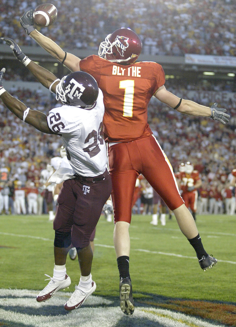
It is not like the all-cardinal look is *that* new, though...

_iiAuxZL_400x400.jpg


iowastate_todd_blythe.jpg


image


...so I imagine it will always be with us at this point.
 

cymonw1980

Well-Known Member
SuperFanatic
SuperFanatic T2
Nov 23, 2015
1,060
1,818
113
Raleigh, NC
View attachment 65314 I really like these new cardinal jerseys! Can we now say that our home set is now at least nearing the excellence of our away sets?

love c-c-c, w-c-w are cool too. b-b-b are good for a change up. don't really care for the other mix/match uniforms. but that is just me... I am just happy to have more cardinal (no black collars)...
 

t-noah

Well-Known Member
Feb 2, 2007
19,780
13,417
113
I realize the C-C-C is probably here to stay as a primary home look, even if I still dislike monochromatic looks and think it looks like a high school sort of aesthetic.

That being said, just having a little variety... C-C-W is no good, C-C-B is maybe slightly better but not really good, so would having C-C-G occasionally be too much to ask? I think the c-c-b would be a good look. I don't think we've seen that yet. It might not be as good as the b-c-c but. Would the c-c-g be too much to ask for? Absolutely not! That is what I am saying and I am in complete agreement.

It is not like the all-cardinal look is *that* new, though...

_iiAuxZL_400x400.jpg


iowastate_todd_blythe.jpg


image


...so I imagine it will always be with us at this point.
The all cardinal look (cardinal rush if you will) I thought was something relatively new. Maybe a time or two in the chizik/rhoads era? I did not really pay attention to a lot of the McCarney era, being out of state then (and now). Computers were just becoming more prevalent, internet, etc, but still not like today. I did not realize McCarney did that much all-cardinal but I guess maybe he did.

I do not think that before McCarney there was much all cardinal. I could be wrong.
 

IASTATE07

Well-Known Member
SuperFanatic
SuperFanatic T2
May 30, 2016
12,784
20,442
113
The all cardinal look (cardinal rush if you will) I thought was something relatively new. Maybe a time or two in the chizik/rhoads era? I did not really pay attention to a lot of the McCarney era, being out of state then (and now). Computers were just becoming more prevalent, internet, etc, but still not like today. I did not realize McCarney did that much all-cardinal but I guess maybe he did.

I do not think that before McCarney there was much all cardinal. I could be wrong.

McCarney era was red, not cardinal.
 
  • Funny
Reactions: 2speedy1

Sigmapolis

Minister of Economy
SuperFanatic
SuperFanatic T2
Aug 10, 2011
26,972
41,714
113
Waukee
The all cardinal look (cardinal rush if you will) I thought was something relatively new. Maybe a time or two in the chizik/rhoads era? I did not really pay attention to a lot of the McCarney era, being out of state then (and now). Computers were just becoming more prevalent, internet, etc, but still not like today. I did not realize McCarney did that much all-cardinal but I guess maybe he did.

I do not think that before McCarney there was much all cardinal. I could be wrong.

Cardinal-red-crimson-scarlet whatever it was. :)

The "ketchup bottle" look was definitely the main look from the late 90s until the early Chizik era, when the gold pants came back before the previous look...

300x300.jpg


The above was only worn during 2007 before we went to the Peach Bowl "modernization" look that we just replaced with the new "Campbell" design.
 

t-noah

Well-Known Member
Feb 2, 2007
19,780
13,417
113
love c-c-c, w-c-w are cool too. b-b-b are good for a change up. don't really care for the other mix/match uniforms. but that is just me... I am just happy to have more cardinal (no black collars)...
The No black collar seems to be a home-run so far, yes. I think people will like it so much better than the black collar.

On the other hand, I kind of liked the black collar and the novelty of it (although thought it needed to be modified, did not like the all-solid dark black). Would I mind seeing the black collar again? No, if modified and as a secondary collar. The all cardinal collar is better for most. Doubt we'll see the black collar again now.

Can I give the b-c-c and the w-c-c some love here? Love both of those. I'm surprised that many have commented otherwise. Oh well, uniforms will do that.
 

t-noah

Well-Known Member
Feb 2, 2007
19,780
13,417
113
I still dream of that sharp gold-cardinal-gold look with the tornados on the helmet from earlier in this thread.
Good luck with that, haha. I'm not saying I wouldn't mind seeing it also, the g-c-g as part of an occasional normal routine; the the tornado on the helmet as a retro surprise look.

The odds of both those happening any time soon? Astonomical. :(
 
  • Like
Reactions: bgprest

theshadow

Well-Known Member
Apr 19, 2006
20,008
19,700
113
I do not think that before McCarney there was much all cardinal. I could be wrong.

Red pants were introduced by Walden in '93 (for the Iowa game), but the helmet was yellow. The red pants were used occasionally in '93 and '94...

1994-game-11-photo.jpg


...and then the look switched in '95 (under Mac) to red helmet, red/white jersey, red/white pants. The monochrome red look didn't start until '99, with the new Russell uniforms...

D_MiGVvVAAAXnVF


...and that was the primary home look through the Russell era ('99-'02) into the Nike era ('03-'06) before Chiz switched to gold pants in '07.
 

Statefan10

Well-Known Member
SuperFanatic
SuperFanatic T2
May 20, 2019
21,191
27,215
113
Red pants were introduced by Walden in '93 (for the Iowa game), but the helmet was yellow. The red pants were used occasionally in '93 and '94...

1994-game-11-photo.jpg


...and then the look switched in '95 (under Mac) to red helmet, red/white jersey, red/white pants. The monochrome red look didn't start until '99, with the new Russell uniforms...

D_MiGVvVAAAXnVF


...and that was the primary home look through the Russell era ('99-'02) into the Nike era ('03-'06) before Chiz switched to gold pants in '07.
I'd be fine with gold pants again if we only wore them once at home and once on the road. Right now, the monochromatic look is in (all white, all black, all primary color) and I think it looks pretty sharp. I did like how last year we did not wear all cardinal every single home game like we essentially did all 2017. I hope this year we mix it up like we did last year. I also love that top look with the gold helmet and the cyclones decal in cursive. I would say getting a gold helmet would certainly complete our uniforms and allow us to do many things. The thing I desperately would like to see is an actual throwback uniform. I'm talking the whole entire retro uniform with the decal and all, but the quality staying the same. We've done a few in the past but usually since they're for one game, the quality of the uniform is not up to par.
 
  • Agree
Reactions: SolarGarlic

WalkingCY

Well-Known Member
Sep 26, 2008
6,895
2,592
113
Kansas City
I still dream of that sharp gold-cardinal-gold look with the tornados on the helmet from earlier in this thread.

Main home look should be Gold-Cardinal-Gold. It's still pretty unbelievable ISU does NOT have this option.

CCC once in a while would be ok for a change in pace. But mostly, it screams low-level "Fresno State" -looking unis (IMO).
 
Last edited:

2speedy1

Well-Known Member
Jan 4, 2014
6,684
7,535
113
McCarney era was red, not cardinal.
Just a quick question, what color is a Cardinal bird, or what color do Catholic cardinals wear? Not some flat burnt maroon. This color argument of what is actually cardinal and what is not, and what is gold and what is not is so subjective, its just plain stupid. And comparing our colors to ketchup and mustard is such a Hawk thing to do. We have primary colors of red and yellow shades they will always be similar to that. Just like the Hawks will look like bumble bees. Can we please get over the color shade argument. No one is right, who says one is the actual true color really?
 
  • Like
  • Agree
Reactions: t-noah and Cycho1

Sigmapolis

Minister of Economy
SuperFanatic
SuperFanatic T2
Aug 10, 2011
26,972
41,714
113
Waukee
Imagine this uniform, but with cardinal. It would be glorious.

The I-State logo just does not look good on a gold background is the problem.

It looks good on white and black and okay on a red background, but the gold outline on a gold helmet just makes the thing kind of wash out and look like a thin "I" logo.

Just a quick question, what color is a Cardinal bird, or what color do Catholic cardinals wear? Not some flat burnt maroon. This color argument of what is actually cardinal and what is not, and what is gold and what is not is so subjective, its just plain stupid. And comparing our colors to ketchup and mustard is such a Hawk thing to do. We have primary colors of red and yellow shades they will always be similar to that. Just like the Hawks will look like bumble bees. Can we please get over the color shade argument. No one is right, who says one is the actual true color really?

I thought Parks Library had the original cloth patches that defined our cardinal and gold...?
 

Statefan10

Well-Known Member
SuperFanatic
SuperFanatic T2
May 20, 2019
21,191
27,215
113
The I-State logo just does not look good on a gold background is the problem.

It looks good on white and black and okay on a red background, but the gold outline on a gold helmet just makes the thing kind of wash out and look like a thin "I" logo.


I thought Parks Library had the original cloth patches that defined our cardinal and gold...?
I agree that the I State logo would have to be switched. Give me the old tornado, or cyclones in the cursive font.