
No forums found...
Site Related
Iowa State
College Sports
General - Non ISU
CF Archive
Install the app
Iowa State Uniform Discussions (update: new basketball unis)
- Thread starter CyTwins
- Start date
No forums found...
Site Related
Iowa State
College Sports
General - Non ISU
CF Archive
You are using an out of date browser. It may not display this or other websites correctly.
You should upgrade or use an alternative browser.
You should upgrade or use an alternative browser.

I'm genuinely impressed that this list can be made without mentioning the Bucs' beautiful Creamsicle uniforms (which others have since brought up) or hat the Eagles desperately need to go back to Kelly Green.Half the NFL has better throwbacks than current uniforms.
And the other half are already wearing a classic look.
Teams that should "go back" --
Dolphins -- nothing wrong with those 70s uniforms
Patriots -- Pat Patriot and the red and white please
Jets -- the Namath era uniforms were perfection
Jaguars -- their original 90s look kicks the snot out of their current ones
Titans -- the Air McNair look was better than this look
Broncos -- better with orange, but even better with the "Orange Crush" look
Commanders -- should have used a lighter touch with the update
Falcons -- their throwbacks are so good and their new ones are so bad
Rams -- there was no need for an update/redesign of their classic look
Seahawks -- the blue/silver was way better than generic navy
Might be some others, but those came to mind thinking through the divisions.
Buffalo is the perfect example of "going back" being the right move. Their navy look in the 2000s was just bad. Going back to they royal and red with traditional striping has been a solid look for a decade now.Half the NFL has better throwbacks than current uniforms.
And the other half are already wearing a classic look.
Teams that should "go back" --
Dolphins -- nothing wrong with those 70s uniforms
Patriots -- Pat Patriot and the red and white please
Jets -- the Namath era uniforms were perfection
Jaguars -- their original 90s look kicks the snot out of their current ones
Titans -- the Air McNair look was better than this look
Broncos -- better with orange, but even better with the "Orange Crush" look
Commanders -- should have used a lighter touch with the update
Falcons -- their throwbacks are so good and their new ones are so bad
Rams -- there was no need for an update/redesign of their classic look
Seahawks -- the blue/silver was way better than generic navy
Might be some others, but those came to mind thinking through the divisions.
It's criminal that the Eagles don't go back to Kelly Green and Silver. Just a great look overall
I'm genuinely impressed that this list can be made without mentioning the Bucs' beautiful Creamsicle uniforms (which others have since brought up) or hat the Eagles desperately need to go back to Kelly Green.
Buffalo is the perfect example of "going back" being the right move. Their navy look in the 2000s was just bad. Going back to they royal and red with traditional striping has been a solid look for a decade now.
Yeah, definitely a few I missed up there. Buffalo and the Chargers should be the role models for all.
Some might be a matter of taste (e.g., the 60s Falcons versus the "dirty birds" 90s Falcons where either look would be superior to their current one). I just don't think the current Bucs (well, the 90s Bucs) look is actively offensive compared to many others even if they have the creamsicle waiting.
Two observations from the DM highlights on ISU's IG:
1. The Bears look good in orange - I just hope they don't try anything too garish, like orange helmet with navy shirt & pants, although orange over white shirt with navy pants may not look too bad (until I saw it on the field, perhaps... )
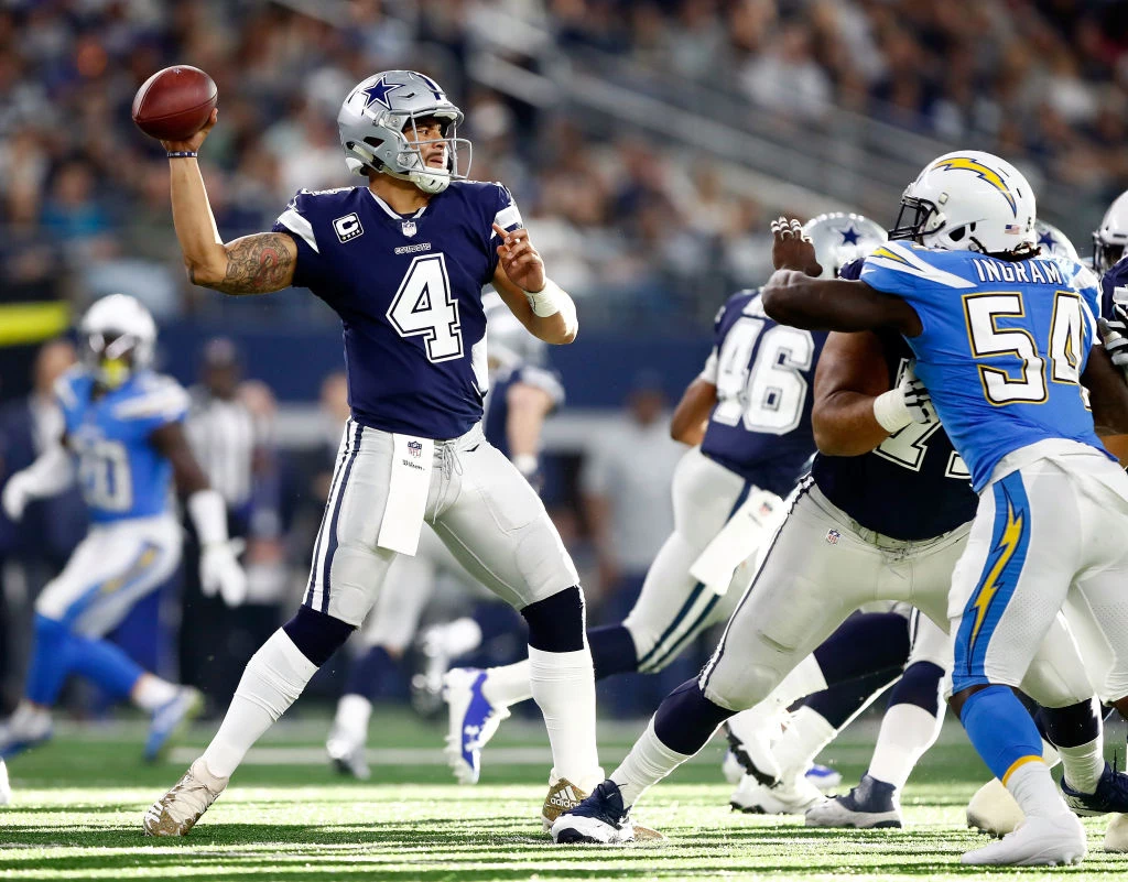
2. The Cowboys uniforms are a total mess - the white outline around the white numbers on the navy shirt is terrible - navy vs royal on the "home" uniform - "silver" vs silver pants - **** weird tradition, time to clean that mess up
1. The Bears look good in orange - I just hope they don't try anything too garish, like orange helmet with navy shirt & pants, although orange over white shirt with navy pants may not look too bad (until I saw it on the field, perhaps... )
2. The Cowboys uniforms are a total mess - the white outline around the white numbers on the navy shirt is terrible - navy vs royal on the "home" uniform - "silver" vs silver pants - **** weird tradition, time to clean that mess up
The Broncos need to go back to their old uniforms too.It's criminal that the Eagles don't go back to Kelly Green and Silver. Just a great look overall
Two observations from the DM highlights on ISU's IG:
1. The Bears look good in orange - I just hope they don't try anything too garish, like orange helmet with navy shirt & pants, although orange over white shirt with navy pants may not look too bad (until I saw it on the field, perhaps... )
2. The Cowboys uniforms are a total mess - the white outline around the white numbers on the navy shirt is terrible - navy vs royal on the "home" uniform - "silver" vs silver pants - **** weird tradition, time to clean that mess up
I like the Bears' orange jersey as a changeup a few times a year around Halloween. It is also nice against other navy blue teams, of which there are far too many in the league right now.
I think it looks better paired with a navy helmet, though --

The orange/orange/white is just too much orange. Clemson makes it work but not the Bears.
The Cowboys just need to pick one shade of blue and one shade of silver and stick with it across their various uniforms. Their classic "Ice Bowl" look of a royal blue with silver is gorgeous --

Just do that and make a "home" version for the rare instances where they need to wear a color uniform out of the white one by flipping the white and the royal blue and you're done.
Oh my gosh, Purdue is wearing an absolute abomination today...

Oh my gosh, Purdue is wearing an absolute abomination today...
It's not that bad...... seen a lot worse.
I like the Bears' orange jersey as a changeup a few times a year around Halloween. It is also nice against other navy blue teams, of which there are far too many in the league right now.
I think it looks better paired with a navy helmet, though --
View attachment 104894
The orange/orange/white is just too much orange. Clemson makes it work but not the Bears.
The Cowboys just need to pick one shade of blue and one shade of silver and stick with it across their various uniforms. Their classic "Ice Bowl" look of a royal blue with silver is gorgeous --
View attachment 104895
Just do that and make a "home" version for the rare instances where they need to wear a color uniform out of the white one by flipping the white and the royal blue and you're done.
I think I read somewhere that in regards to the Cowboys uniforms that the reason why they wear the "silver" (if you can call it that) pants that they do is it had something to do with the way they appeared on black and white TVs was the look that they were going for, but then you post a pic like this of the Ice Bowl where the silver is more of a dark grey (which looks really good, btw), and I don't know what to think anymore.
All I know is those blue-silver pants look terrible, especially considering it doesn't match the rest of the uniform, but it's just a bad color overall.
They still have the actual gray/silver pants, but they only wear them with the navy "away" jerseyI think I read somewhere that in regards to the Cowboys uniforms that the reason why they wear the "silver" (if you can call it that) pants that they do is it had something to do with the way they appeared on black and white TVs was the look that they were going for, but then you post a pic like this of the Ice Bowl where the silver is more of a dark grey (which looks really good, btw), and I don't know what to think anymore.
All I know is those blue-silver pants look terrible, especially considering it doesn't match the rest of the uniform, but it's just a bad color overall.
“The ‘Cowboys Star Blue,’ which is the pants you see with the home white jerseys now, actually originated with Tex Schramm. Apparently, he had a car that he had seen – I’m not sure if he owned the car or if he just saw it – but he saw a car with that color interior and fell in love with it. So we had dye lots. That fabric is a dye-lotted color, so we have to order certain number of yards to produce it in that dye lot. So that pant color has become the color of the Cowboys for their home games.”
Here's the real reason behind the Dallas Cowboys’ mismatched uniform colors | FOX Sports
The Cowboys' uniforms are the quirkiest in the NFL, but where did it all begin?
That combo looks sharp and gets away from the ick-blue-gray pant, but still not as cool as '70s-era blue/gray/silver. (Basic difference is the jersey numeral, which I don't hate, but adds nothing to it for me).They still have the actual gray/silver pants, but they only wear them with the navy "away" jersey
Here's the real reason behind the Dallas Cowboys’ mismatched uniform colors | FOX Sports
The Cowboys' uniforms are the quirkiest in the NFL, but where did it all begin?www.foxsports.com

Half the NFL has better throwbacks than current uniforms.
And the other half are already wearing a classic look.
Teams that should "go back" --
Dolphins -- nothing wrong with those 70s uniforms
Patriots -- Pat Patriot and the red and white please
Jets -- the Namath era uniforms were perfection
Jaguars -- their original 90s look kicks the snot out of their current ones
Titans -- the Air McNair look was better than this look
Broncos -- better with orange, but even better with the "Orange Crush" look
Commanders -- should have used a lighter touch with the update
Falcons -- their throwbacks are so good and their new ones are so bad
Rams -- there was no need for an update/redesign of their classic look
Seahawks -- the blue/silver was way better than generic navy
Might be some others, but those came to mind thinking through the divisions.
As much as I like the Pat Patriot logo, the uniforms, and color scheme, one thing has always bothered me about the uniform:
If they're the Patriots, why are they dressed like the redcoats?
/cdn.vox-cdn.com/uploads/chorus_image/image/70224754/154839575.jpg.0.jpg)

All they need to do is wear gold pants. All that read was hard on my eyes yesterday.
The uniforms sure looked very orange during some of the broadcast on ESPN+ yesterday.
The entire game looked yellow. That was a broadcast issue. The reddit game thread was calling it the jaundice bowl.The uniforms sure looked very orange during some of the broadcast on ESPN+ yesterday.