
No forums found...
Site Related
Iowa State
College Sports
General - Non ISU
CF Archive
Install the app
Iowa State Uniform Discussions
- Thread starter CyTwins
- Start date
No forums found...
Site Related
Iowa State
College Sports
General - Non ISU
CF Archive
You are using an out of date browser. It may not display this or other websites correctly.
You should upgrade or use an alternative browser.
You should upgrade or use an alternative browser.
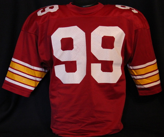
I don’t think they wanted those exact colors — this is just a shopped photo of Bret Meyer from the throwback game against Iowa — Nike could certainly make them (they already had), but that’s not what the school wanted
I couldn't recall if that was "official" or just a prototype sample. I can't seem to locate any story that goes w/ the pic, I happened to remember seeing it at the time and quick-search found it.
I don't know if I would've wanted pants that "shiny" anyway, but the cardinal & gold tone throughout jersey/pants were different from actual and somewhat closer to the late-'70s & the '06 throwback, which I think was the goal. Actual was brighter for both colors.
Will isn't black.
I was hurrying to get some of these mocks done before the reveal. My template was of a black player. When I was doing the number font, 23 or 32 was perfect, in order to get the proper sizing. I needed a long name also to get the sizing correct in the nameplate. I selected McLaughlin, #23, without having a different color for the white player. I work slow. This is more finished now...LOL. I knew some knitpicker would notice that. Work in progress here.
CaucasTWhiteShoeRed-BrownCle...jpg")
[I do not have the correct university font for the numbers, so these will do for now, no pun intended. I'm going to keep this overall template for a while longer, before updating to a new unis template, post reveal.]
I was really hoping for either a pant or helmet stripe on the new uniforms (not necessarily both). Now that we have the reveal and know that there are no stripes, it's not inconceivable that they could order, and have some helmet stripe decals made and delivered. It wouldn't be too late for that. Doubtful this staff would do it, but it's possible.
CaucasTWhiteShoeRed-BrownCleats.jpg") Having the helmet stripe decals available, you could have an either or look.
Having the helmet stripe decals available, you could have an either or look.That’s JTS predecessor. Clyde Williams fieldPlease explain - that def doesn't look like "astroturf" - what was it?
Why did we change?Now that's an old school FB stadium and field! And yes, those were good unis, and why we changed colors is pretty unreal, when you think about it.
Looking at the very good detail of the endzone, it is amazing what the grass must go thru (with all that paint). Had to have about killed it by the end of the year. Look at the red letters of the endzone, one step before dead and gone. LOL
Milk will always be in style, in my book!
Which time?Why did we change?
It's a good question. We were playing Pin the Tale on the Donkey for quite a while, I think, with colors.
Criner brought a new look when he came in 1983. He replaced those colors with a brighter red and a yellow similar to the Packers. He tried to copy the Majors era uniforms with a few elements that did not exist back then. Nobody ever changed the colors back until 2008Why did we change?
"Milk. It's what's for dinner."Milk will always be in style, in my book!
I think you're close. Bruce lightened up our cardinal in '73 and Duncan lightened our gold in '79. Criner brought a new look, yes, but I'm not sure he changed the color scheme. I don't think he did (at least according to this site). Take a look at the evolution of the ISU cardinal and gold here...Criner brought a new look when he came in 1983. He replaced those colors with a brighter red and a yellow similar to the Packers. He tried to copy the Majors era uniforms with a few elements that did not exist back then. Nobody ever changed the colors back until 2008

Football Uniforms
The Iowa State football team has seen a large amount of coaching turnover. With each coach, a new uniform comes along. Because of this there have been quite a few different football uniforms...
cycloneuniforms.weebly.com
If you do a color check on all the years from 1947 to 2023 (on this web page anyway, which I did), you get this...

Again, Earl Bruce brightened our cardinal in '73. Donnie Duncan was the first coach to 'brighten' up our 'sunflower' gold (which we had had since 1954, btw), to yellow, in 1979! Criner then did NOT change the color scheme, from '83-'86, he left it alone. Walden left the color scheme alone also, not changing it, until his last two years, '93-'94, when he 'brightened the yellow' even more (from Duncan). [It may have seemed like Criner and Walden changed the color scheme, as they had some very different designs, and added white where it had not been before? And their helmets were too bright and shiny, IMO.]
When McCarney came on, he had two color change phases, '95 and '03, as the above illustration indicates. We've had, essentially our current shade of cardinal (one change in 2014) and gold (yellow) since 2008, Chizik's 2nd and last year.
I would love it if someone from the athletic dept. could verify, or specify our exact colors from 1947. The colors from the weebly site could be off a bit, or they could be largely accurate.
The white helmet is sick and now has a full uni set that matches. Definitely upgraded that set, but I think C/W/C is still our best uni. The good news is our home C/C/W is now our second best instead of 5th or 6th.
It is perplexing that they didn't add any white to the cardinal helmet with this new cardinal jersey and set. Before, it was not enough white. Now, too much white and the set is still unbalanced with the old cardinal helmet.I don’t like the Cardinal helmet. It makes no sense to have more “white” on the Home Cardinal top and not have any white on the helmet.
Again, it could still be fixed IF they ordered extra "white bumpers" to be used on the cardinal helmets with a c/c/w set. They could also just use a white chinstrap with the cardinal helmet and the c/c/w. I doubt they will do either, though. They seem to be set on the black chinstrap look. I don't think they think of the details.
I'm pessimistic on how they develop and implement football uniforms with this regime. And not necessarily this regime only; bad football uniform decisions go back a long way in Iowa State history.
I don't think that's terribly accurate, the current "official athletic colors" don't come close to matching our red pantone.I think you're close. Bruce lightened up our cardinal in '73 and Duncan lightened our gold in '79. Criner brought a new look, yes, but I'm not sure he changed the color scheme. I don't think he did (at least according to this site). Take a look at the evolution of the ISU cardinal and gold here...
Football Uniforms
The Iowa State football team has seen a large amount of coaching turnover. With each coach, a new uniform comes along. Because of this there have been quite a few different football uniforms...cycloneuniforms.weebly.com
If you do a color check on all the years from 1947 to 2023 (on this web page anyway, which I did), you get this...
View attachment 128753
Again, Earl Bruce brightened our cardinal in '73. Donnie Duncan was the first coach to 'brighten' up our 'sunflower' gold (which we had had since 1954, btw), to yellow, in 1979! Criner then did NOT change the color scheme, from '83-'86, he left it alone. Walden left the color scheme alone also, not changing it, until his last two years, '93-'94, when he 'brightened the yellow' even more (from Duncan). [It may have seemed like Criner and Walden changed the color scheme, as they had some very different designs, and added white where it had not been before? And their helmets were too bright and shiny, IMO.]
When McCarney came on, he had two color change phases, '95 and '03, as the above illustration indicates. We've had, essentially our current shade of cardinal (one change in 2014) and gold (yellow) since 2008, Chizik's 2nd and last year.
I would love it if someone from the athletic dept. could verify, or specify our exact colors from 1947. The colors from the weebly site could be off a bit, or they could be largely accurate.

My guess is it has more to do with resources & $$$ & priorities - I don't think CMC or JP stay up at night thinking about costumes - I love talking about unis & concepts & stuff like that, but at the end of the day, I'd rather be Alabama than Oregon (in re: to uniforms)I'm pessimistic on how they develop and implement football uniforms with this regime. And not necessarily this regime only; bad football uniform decisions go back a long way in Iowa State history.
Speaking of, I wonder if Alabama opens things up with Saban gone...
It doesn't look like mustard next to our 'cardinal'.Someone help me understand the obsession with the 49er gold?
My guess is it has more to do with resources & $$$ & priorities - I don't think CMC or JP stay up at night thinking about costumes - I love talking about unis & concepts & stuff like that, but at the end of the day, I'd rather be Alabama than Oregon (in re: to uniforms)
Speaking of, I wonder if Alabama opens things up with Saban gone...
Good question. I hear Alabama leaked its redesign:


Fixed it

Regarding your point here, with the red Pantone 186 C, that's used in their "university colors" which are not used on the athletic uniforms. For the "athletic" uniforms, they use Pantone 187 C (for cardinal, which is considerably darker) and Pantone 123 C (for gold/yellow, which is brighter than their "university" gold/yellow).I don't think that's terribly accurate, the current "official athletic colors" don't come close to matching our red pantone. View attachment 128764
Many non-ISU sites on the web will list our official Cyclones colors using the "university" ISU color swaths. They are both correct and incorrect when they do this. They are incorrect in terms of our "athletic" uniforms.
The weebly site could be spot on, or 'off a little', or 'off a lot'. I'm not sure. I think that site is pretty close with most of their illustrations, until someone from the athletic dept. comes on to tell me otherwise, and provides us with a list of past used hex codes/RGB/or Pantone #s.
See these 2 recent posts, also.
It can be confusing, colors, shades. Someone correct me if I am wrong, but I believe our 'athletic gold' is what is used in our ISU team uniforms. It is the shade of gold many of us just call yellow and is considered too bright by many. Our 'university gold' is a slightly darker, more mellow shade of gold, and is used for marketing, administrative purposes (I'm not really sure where they use it entirely). It is still pretty "yellow" but I like it better than our 'athletic gold', to be honest.
I don't think our 'university gold' is ever used with our team unis. "Ever" might be stretching it, who knows.
Our 'university gold and cardinal' (quite bright, the university cardinal) and our 'athletic gold and cardinal are all part of our "official" sanctioned colors. They are just used differently.
Yes, the 186 C, and the 142 C Pantones being our 'university' cardinal and gold colors. They are not (usually) found on the ISU athletic uniforms.
For that, they use the other official cardinal and gold, the 'athletic' ones, designated on this page as, "Cyclone Cardinal (Alternate), Pantone 187 C; and "Cyclone Gold", Pantone 123 C
View attachment 128651 The RGB can sometimes vary slightly, so Pantone # is more accurate. The bottom 2 colors here, are what ISU uses for their Athletic Team Uniforms.
.png") All 4 of these color shades are "official". We only use the bottom 2 on the uniforms, however. T
All 4 of these color shades are "official". We only use the bottom 2 on the uniforms, however. TI value your opinion because you've been accurate before. And yes, it sure seemed like the color scheme brightened significantly with Criner. But look at the weebly site, ISU FB uniform history again (https://cycloneuniforms.weebly.com/football-uniforms.html). It's interesting and informative. It could be incorrect though.Criner brought a new look when he came in 1983. He replaced those colors with a brighter red and a yellow similar to the Packers. He tried to copy the Majors era uniforms with a few elements that did not exist back then. Nobody ever changed the colors back until 2008
Take a look at these also.
Iowa State Football Jersey Collection
www.cyclonejerseys.com