Alright, I did a quick search through the forums and don't really see a thread like this one. If there is one, my bad.
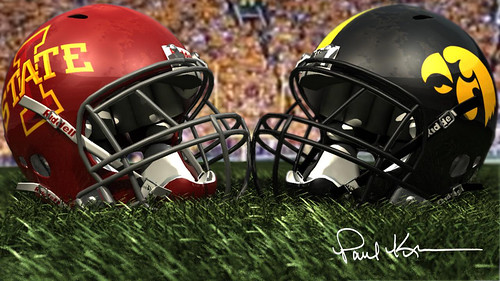
Anyway, so I remember talking about this with a few friends during the previous Iowa-Iowa State game and we all came to the not so original conclusion that the Cy-Hawk Trophy is ugly and seems really cheap (I remember the football looking like it was about to fall off when the trophy was being lifted). I mean, it's no Land Grant trophy...http://blogs.mcall.com/.a/6a00d8341c4fe353ef0120a6b01508970b-320wi (what IS that?!)
Here's the current trophy...

I'll admit that I don't know the design history of the trophy, so these are my personal views. The wooden box is a standard base for a trophy, though it could probably be upgraded. What gets me though are the figures on top. You have the skinny looking football player doing the stiff-arm pose. Okay, that's fine, I suppose, though he doesn't look like much of a football player. But just in case people didn't know it was a football trophy, they threw the giant football in there to really drive home the message.
Personally, I'd like to see the figures up top replaced with the two mascots, facing off. Herky in his uppercut pose and Cy sitting in his cyclone. Or if you really wanted to be creative, you'd have the two rolling up their sleeves, getting ready for a fight. Either way, the Cy-Hawk trophy shouldn't just have the namesakes in tiny images on the side.
Another alternative that would probably be classier, would be to have two statuettes of Jack Trice and Nile Kinnick. Trice was ISU's first African-American athlete and Jack Trice is the only stadium named after an African-American (only 1-A). Kinnick was Iowa's sole Heisman Trophy winner and Kinnick Stadium is the only stadium named after a Heisman winner. Both young men were taken much too early; Trice playing for his team, and Kinnick while serving his country.
Thoughts?
Anyway, so I remember talking about this with a few friends during the previous Iowa-Iowa State game and we all came to the not so original conclusion that the Cy-Hawk Trophy is ugly and seems really cheap (I remember the football looking like it was about to fall off when the trophy was being lifted). I mean, it's no Land Grant trophy...http://blogs.mcall.com/.a/6a00d8341c4fe353ef0120a6b01508970b-320wi (what IS that?!)
Here's the current trophy...
I'll admit that I don't know the design history of the trophy, so these are my personal views. The wooden box is a standard base for a trophy, though it could probably be upgraded. What gets me though are the figures on top. You have the skinny looking football player doing the stiff-arm pose. Okay, that's fine, I suppose, though he doesn't look like much of a football player. But just in case people didn't know it was a football trophy, they threw the giant football in there to really drive home the message.
Personally, I'd like to see the figures up top replaced with the two mascots, facing off. Herky in his uppercut pose and Cy sitting in his cyclone. Or if you really wanted to be creative, you'd have the two rolling up their sleeves, getting ready for a fight. Either way, the Cy-Hawk trophy shouldn't just have the namesakes in tiny images on the side.
Another alternative that would probably be classier, would be to have two statuettes of Jack Trice and Nile Kinnick. Trice was ISU's first African-American athlete and Jack Trice is the only stadium named after an African-American (only 1-A). Kinnick was Iowa's sole Heisman Trophy winner and Kinnick Stadium is the only stadium named after a Heisman winner. Both young men were taken much too early; Trice playing for his team, and Kinnick while serving his country.
Thoughts?
Last edited: