Do those jerseys come in men's sizes?I'd like to see a black jersey w/ metallic red numbers, black pants, red chrome helmet with matte black stencil I-State logo used as an alternate.


No forums found...
Site Related
Iowa State
College Sports
General - Non ISU
CF Archive
Install the app
Iowa State Uniform Discussions
- Thread starter CyTwins
- Start date
No forums found...
Site Related
Iowa State
College Sports
General - Non ISU
CF Archive
You are using an out of date browser. It may not display this or other websites correctly.
You should upgrade or use an alternative browser.
You should upgrade or use an alternative browser.
Well the pants look plain again this year, according to this video.
I really like the addition of the yellow lightning around the sleeve versus the red we had last year. Obviously the red on red you couldn't even see. This yellow is a great addition.

What I would give for a set of gold pants to go with this set.
If people are adverse to gold jerseys or other elements for various reasons, I get it, but pairing up gold pants with our current setups...
C - C - G
C - W - G
W - W - G
W - C - G even
...would be beautiful.


You are not in the minority here. A good general rule is 2 colors only. More than two just doesn't work well. Case in point, the w-c-g , no good. An exception would be the c-w-g, like USC. That looks pretty good and is classic (for USC), but white jersey makes that work.I might be in the minority here but I don't really like the three-color variations. It doesn't look "uniform" enough to me.
I like combos like C-W-C, W-W-C, B-C-C, etc. over something like W-C-G or C-W-G.
Yeah that Akron combo was the worst of the season IMO. It could have been much better w/ red socks (details matter). It would be infinitely better with gold pant for sure, c-c-g!That is a fair critique, and I adore our C-W-W and C-W-C and W-W-W looks.
But even if only for this, making these pants gold...

...would look way better than the unbalanced colors above.
Akron going all-white did not help things, either, I suppose.
I played around w/ the yellow sleeve a while back, with different collars on the red jersey. For some reason (very strong yellow) the gold sleeve just did not work or look good.I really like the addition of the yellow lightning around the sleeve versus the red we had last year. Obviously the red on red you couldn't even see. This yellow is a great addition.
However w/ this straight cardinal collar, the gold sleeve looks great! I agree. Can't wait to see more pics.
View attachment 65223 View attachment 65224 View attachment 65225 View attachment 65226
You are not in the minority here. A good general rule is 2 colors only. More than two just doesn't work well. Case in point, the w-c-g , no good. An exception would be the c-w-g, like USC. That looks pretty good and is classic (for USC), but white jersey makes that work.
Yeah that Akron combo was the worst of the season IMO. It could have been much better w/ red socks (details matter). It would be infinitely better with gold pant for sure, c-c-g!
I can see W-C-G not being everybody's taste, but, my oh my...
C-C-G looks great -- a USC combination, yes, but our look is different enough now.
C-W-G looks really good, too, even if a little more of a USC feel to it.
W-W-G would be nice against a red team on the road, too.
Nice mock-ups. I am so glad they ditched that black collar.
View attachment 65223 View attachment 65224 View attachment 65225 View attachment 65226
You are not in the minority here. A good general rule is 2 colors only. More than two just doesn't work well. Case in point, the w-c-g , no good. An exception would be the c-w-g, like USC. That looks pretty good and is classic (for USC), but white jersey makes that work.
Yeah that Akron combo was the worst of the season IMO. It could have been much better w/ red socks (details matter). It would be infinitely better with gold pant for sure, c-c-g!
As others have said, such as @Dandy, I generally think 2-color in some combo usually looks better than 3, but W-C-G could work, I'd have to see it used In Reality to know for sure.
Edit: WCG seems unique, too, going purely from memory -- how many schools use White-Primary-Secondary combination with any regularity? I'm sure it's more common than I think, but not sure of any without researching.
Last edited:
But even if only for this, making these pants gold......would look way better than the unbalanced colors above.
Here's my dime-store quality photo-tweak, to give a basic idea.

The leggings and shoes being white is weird under it, but that's already much better.
Doesn't scream USC, either. Too many differences.
The leggings and shoes being white is weird under it, but that's already much better.
Doesn't scream USC, either. Too many differences.
My photo-editing "skill" and limited platform preclude me from effectively adjusting the socks/shoes detail. I agree that part of the package could benefit from gold/cardinal (perhaps black shoes). Hopefully a true designer can refine my rudimentary mock-up.
My photo-editing "skill" and limited platform preclude me from effectively adjusting the socks/shoes detail. I agree that part of the package could benefit from gold/cardinal (perhaps black shoes). Hopefully a true designer can refine my rudimentary mock-up.
Good work nonetheless
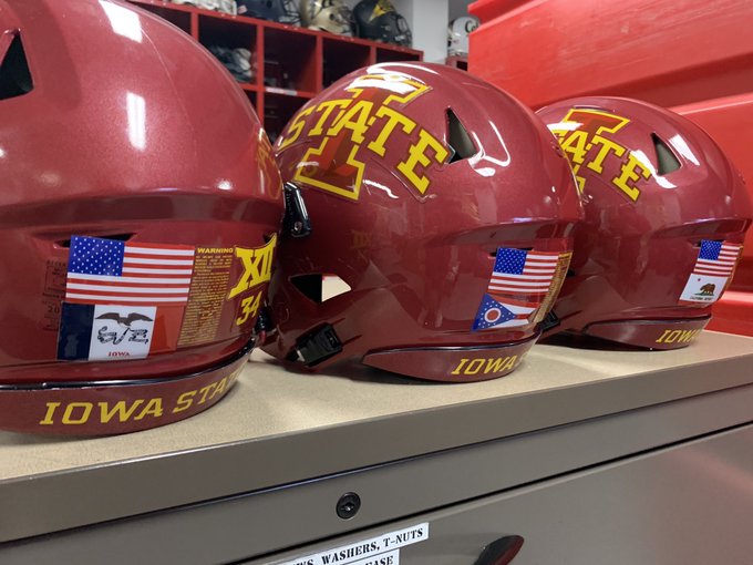
Looks like we're adding stickers of players' home state flag to the helmets, under the American flag. Kinda cool.
At this point in jersey trends, it seems like the only way you can have different colored jerseys and pants is with an old school, traditional look (think Alabama, Florida, Ohio State). The pants usually have stripes. If you don't have that, they look like high school jerseys.
With our more modern look, if the pants are going to be one solid color, the jerseys have to be the same color. At least for home jerseys. The white of the away jersey looks great with anything.
With our more modern look, if the pants are going to be one solid color, the jerseys have to be the same color. At least for home jerseys. The white of the away jersey looks great with anything.
At this point in jersey trends, it seems like the only way you can have different colored jerseys and pants is with an old school, traditional look (think Alabama, Florida, Ohio State). The pants usually have stripes. If you don't have that, they look like high school jerseys.
With our more modern look, if the pants are going to be one solid color, the jerseys have to be the same color. At least for home jerseys. The white of the away jersey looks great with anything.
I like single color, large numbers... I think some of the examples below would be cool (In Cyclone Colors, Red, Yellow, White... could also do Black or Grey)... for helmet, preference would be same color as uniform.. but could do some chrome or flat options to change it up.
Current uniforms are cool, but would prefer collars that were same color as uniforms and larger numbers (like examples below). For the Helmets it would be cool to have one with an "S" or the jersey number for some change ups... like below...


With our more modern look, if the pants are going to be one solid color, the jerseys have to be the same color. At least for home jerseys. The white of the away jersey looks great with anything.
The plain-white pants are a difficult mesh with cardinal-cardinal helmet & jerseys, since we have no white accents or numerals on the helmet and uniform. I think it looks OK W-C-W, at least there's a little balance. Not so with CCW. Probably of all the combinations with the current set, that's my least favorite (I don't much like Black-Cardinal-Cardinal, either .... I assume I'm in the minority on that one)
I'm just going to say it.
Gold pants work better if we had a ******* gold/chrome helmet to go with it.
I'm just going to say it.
Gold pants work better if we had a ******* gold/chrome helmet to go with it.
GOLD HELMETS ARE THE SOLUTION
I like single color, large numbers... I think some of the examples below would be cool (In Cyclone Colors, Red, Yellow, White... could also do Black or Grey)... for helmet, preference would be same color as uniform.. but could do some chrome or flat options to change it up.
Current uniforms are cool, but would prefer collars that were same color as uniforms and larger numbers (like examples below). For the Helmets it would be cool to have one with an "S" or the jersey number for some change ups... like below...
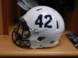

I'd really oppose numbers that large on the front, they just look disproportionate. Traditionalist in me wishes the name was still on the front of the jerseys.
Really hope they kept the cardinal jersey with the black trim to wear with the black helmet. Loved that look.

A pretty good look at them. These look sharp and are definitely still the cardinal of last seasons.
A pretty good look at them. These look sharp and are definitely still the cardinal of last seasons.
these look great - like the fact that they got rid of the black collars.
also, saw this:
9:18 AM · Jul 19, 2019 · Twitter for iPhone