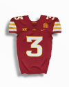
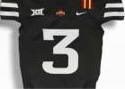
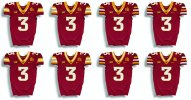
Nike uses the same Cardinal for all of our uniforms. So yes, it is the same. Under the certain light conditions, even our current uniforms look way too "red".This can’t be the same “cardinal” as on our current uniforms, right? It looks brighter and redder. More like McDonald’s.
Needs to be darker.
No forums found...
Site Related
Iowa State
College Sports
General - Non ISU
CF Archive
Install the app
Iowa State Uniform Discussions
- Thread starter CyTwins
- Start date
No forums found...
Site Related
Iowa State
College Sports
General - Non ISU
CF Archive
You are using an out of date browser. It may not display this or other websites correctly.
You should upgrade or use an alternative browser.
You should upgrade or use an alternative browser.
Looks good. But I really think the black uniform is kinda ruined if we add red or yellow. The black and white look is so stark and that's what makes it great. When you add colors to it you dilute it. Just my opinion.Just add a little cardinal and gold to the black and white. Something like below (don't judge my horrible skills)...
View attachment 126869
The more I think about it the more I think the post from yesterday where the fourth image didn’t load is a white/black alt away set.
Also hot take, put me down for a Seneca era throwback set for a home game. Maybe first time Colorado is back in Ames.
i think the straight lines of the sleeve stripes (and trice patch) have an old school feel and it makes the tapered neck design look out of place. the triangle section of the neck seems like the perfect spot for the funnel logo. the sleeve stripes don't look as awkward if you flip flop the gold and white. i agree that the front number looks a little out of whack, so i tweaked that a bit as well.
View attachment 126824
Very nice Ames! Once again, if these unis are real, it shows how much they could benefit from some CF in-house collaboration. There is simply too much design talent on CF that is wasted.i think it looks fine to have white stripes on the outsides with only 3 layers (like on the chiefs red unis), but with 5 stripes and beyond it gets awkward looking...unless you mix in the contrast of the cardinal jersey, in this case. View attachment 126827
I like your edited collar! If they were to decide that was too hard to mass produce, try flipping the gold and white on the original collar? Then could we see both collars with Sleeves #2, 5, and 6? And can we see original sleeve #1, without the top and bottom white stripe?
I feel like this will happen at some point....are we far enough in the future to have a throwback to that era yet?Also hot take, put me down for a Seneca era throwback set for a home game. Maybe first time Colorado is back in Ames.
Whenever the time comes that people think we are, I see it happening. 25th anniversary maybe? Thats getting close.
Were those the dog bone collar unis?Also hot take, put me down for a Seneca era throwback set for a home game. Maybe first time Colorado is back in Ames.
Top Left is the winner with 3 stripes and mostly gold collar.
Collars will likely look a bit different assuming Nike uses the new FUSE tailoring (although, I would prefer sticking with the VAPOR template - less seams, better collar)
athletic dept. could hire our boy joe
the white/cardinal/black concepts remind me of cincinnati. however, i wish we could incorporate cardinal into our black uniforms.
I don't know about you old heads, but I'm a big fan of the cream/ tan one
Every song has been sung and every type of uniform has been created. Good luck finding a uniform so unique its never looked like another.My main concern with the 3 stripe versions, is it gets very close to what Maryland already wears.
View attachment 126905
Yeah, nobody is going to confuse them for Maryland.My main concern with the 3 stripe versions, is it gets very close to what Maryland already wears.
View attachment 126905
I like the 3 stripe more, but either are an improvement over our current uniforms. I do fear that Joe's mockups have set the fanbase up for disappointment when they aren't his mockups. I think many fans will assume those are official.
Also, as far as the mockups go, the numbers on the shoulder are clearly bigger than the photo from the official account. They should be smaller in the mockup.
Agree on your last paragraph so much. I just don’t think we will get a large variety and I don’t think we are getting a white collar either.Yeah, nobody is going to confuse them for Maryland.
I like the 3 stripe more, but either are an improvement over our current uniforms. I do fear that Joe's mockups have set the fanbase up for disappointment when they aren't his mockups. I think many fans will assume those are official.
Also, as far as the mockups go, the numbers on the shoulder are clearly bigger than the photo from the official account. They should be smaller in the mockup.
I would say this is the most likely design. Which is still an improvement imo, but less adventurous.

I would be very happy with those. Huge improvement for our home jerseys, but I'm skeptical that the font style will be the same.Agree on your last paragraph so much. I just don’t think we will get a large variety and I don’t think we are getting a white collar either.
I would say this is the most likely design. Which is still an improvement imo, but less adventurous.
View attachment 126907


