White numbers are SO much better than gold
No forums found...
Site Related
Iowa State
College Sports
General - Non ISU
CF Archive
Install the app
Iowa State Uniform Discussions
- Thread starter CyTwins
- Start date
No forums found...
Site Related
Iowa State
College Sports
General - Non ISU
CF Archive
You are using an out of date browser. It may not display this or other websites correctly.
You should upgrade or use an alternative browser.
You should upgrade or use an alternative browser.
Agree on your last paragraph so much. I just don’t think we will get a large variety and I don’t think we are getting a white collar either.
I would say this is the most likely design. Which is still an improvement imo, but less adventurous.
View attachment 126907
I'm happy with that Jersey. I've seen better variations of the shoulder striping on here but I don't dislike what was shared by ISU football.
I do think our jersey is getting a little 'congested' with all the decals/patches on the front. I wonder what the Jack Trice Logo would look like in the collar area, where the current I-state logo sits.
i agree...it will be impossible to look distinct/unique if you limit yourself to regular horizontal sleeve stripes. if we want to be different with the sleeves we need to throw the trice stripes on there or improve upon our current 'tornadic' sleeve design or something.Every song has been sung and every type of uniform has been created. Good luck finding a uniform so unique its never looked like another.

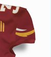
i agree...it will be impossible to look distinct/unique if you limit yourself to regular horizontal sleeve stripes. if we want to be different with the sleeves we need to throw the trice stripes on there or improve upon our current 'tornadic' sleeve design or something.
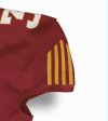
I've been saying the 5-bar logo makes so much more sense than horizontal stripes. People outside the diehards are just learning about the 5-bar/Trice logo and attributing it to ISU. Why not capitalize on that rather than stupid horizontal stripes that don't represent anything?
Thank you!! I like the 1st 3 with each collar, best.
That's like saying all jeans look the same. Yeah, because they are, by nature, jeans. If you're saying there's no creativity and all unis look the same...I couldn't disagree more. As an avid uni-watch follower, here are just a few:Every song has been sung and every type of uniform has been created. Good luck finding a uniform so unique its never looked like another.
Oregon
Army/Navy every single year
Notre Dame's Shamrock Series unis
Iowa's feathered abominations
Northwestern's Gothic unis
Boston College has worn several unique unis
UCLA has standard stripes but they are on the tops of the shoulders
Maryland has unique piping
im curious how that this would like with pads on. Given how tight the jerseys are worn and how small the shoulder pads are now (especially skill positions) would it be recognizable? All would depend on the player I would imagine.View attachment 126925
I've been saying the 5-bar logo makes so much more sense than horizontal stripes. People outside the diehards are just learning about the 5-bar/Trice logo and attributing it to ISU. Why not capitalize on that rather than stupid horizontal stripes that don't represent anything?
Williams & Blum talk a little bit on the uniforms at the 39:37 mark:
Where is the "CF link" CW is referring to (3'16")? I couldn't find it. Could someone post the tweet here and elsewhere?
Where is the "CF link" CW is referring to (3'16")? I couldn't find it. Could someone post the tweet here and elsewhere?
Agree on your last paragraph so much. I just don’t think we will get a large variety and I don’t think we are getting a white collar either.
I would say this is the most likely design. Which is still an improvement imo, but less adventurous.
View attachment 126907
I do like talking uniforms. They should take advantage of the talent here before they make a change. Cases in point here. I don't see why they don't consult us (and some of the top uniform designers on CF) first.i agree...it will be impossible to look distinct/unique if you limit yourself to regular horizontal sleeve stripes. if we want to be different with the sleeves we need to throw the trice stripes on there or improve upon our current 'tornadic' sleeve design or something.
View attachment 126915 View attachment 126916
I think most of us would feel better if we had some input.
The fanbase out east wants these beauties back! View attachment 126930
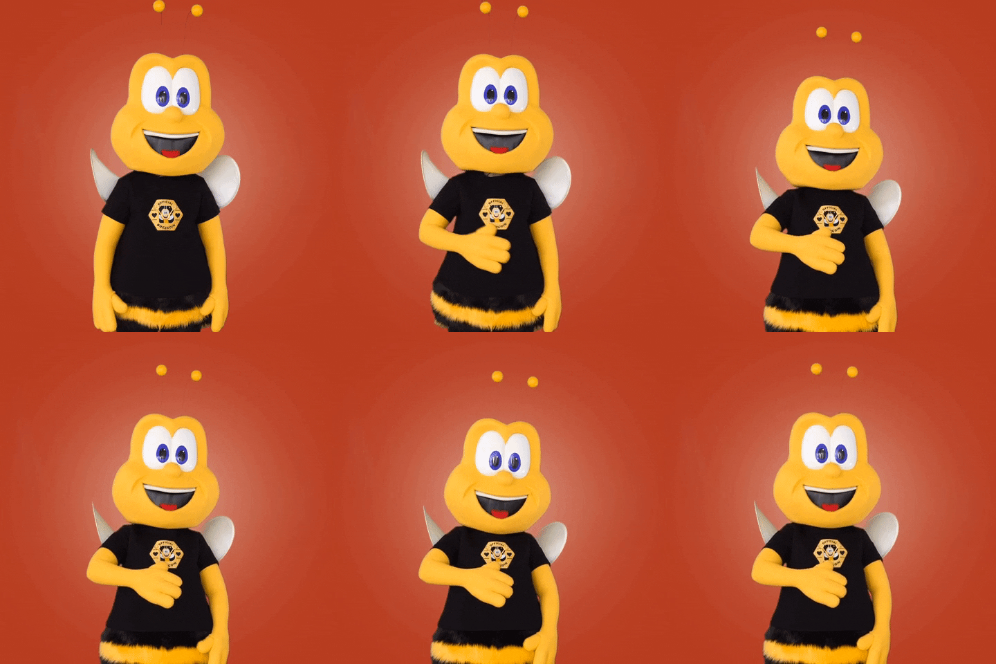
Pains me to say it but these are amazing. I’m a huge fan of 90s throwback unis for all sports. Think these would be a huge hit with millennials and younger if they wore these for a gameThe fanbase out east wants these beauties back! View attachment 126930
What about the pants? Pretty sure they're incorporating white into the home jerseys so they don't clash so much with the white pants. I'm surprised one of you Photoshop experts haven't given us a full uniform mockup yet (I doubt anything is changing with the helmet other than using a white chinstrap with the red lids).
Really?!?! I have always thought these are dumbest looking unis I have ever seen.Pains me to say it but these are amazing. I’m a huge fan of 90s throwback unis for all sports. Think these would be a huge hit with millennials and younger if they wore these for a game
They look like they are trying to put bumble bee wings on them.
They could call it the SWARM of Bumble Bees Throwback Game.Pains me to say it but these are amazing. I’m a huge fan of 90s throwback unis for all sports. Think these would be a huge hit with millennials and younger if they wore these for a game
Nice mockups. The one on the right is basically exactly what I was describing yesterday, white accent. Wonder how it would look if it was larger on the sleeve.i agree...it will be impossible to look distinct/unique if you limit yourself to regular horizontal sleeve stripes. if we want to be different with the sleeves we need to throw the trice stripes on there or improve upon our current 'tornadic' sleeve design or something.
View attachment 126915 View attachment 126916
I also think their is something to using the jack trice bars in the uniform. But I also think the JT logo as a badge as they have it now is very impactful.
It's too legit to quit.Did we ever figure out if the April 1 post is legit?


