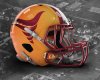
As a way to sort of put an exclamation point on this discussion, I mocked up what should be our permanent helmets using amestoplease's "tornado" concept that tick off a whole variety of boxes while being traditional, modern, and historical all at the same time:

- Separates our brand from USC by using yellow helmets primarily.
- Honors our 120 year old nickname of Cyclones.
- Introduces a bit of white onto the helmet that can be mimicked on the uniform stripes too (a la '70s throwbacks).
- For the purposes of a helmet, the logo used is far more iconic than the current I-STATE. (The I-STATE logo could be on the pants or jersey somewhere.
- Deeper gold color to honor Jack Trice's gold jersey he wore in his only "real game" for ISU.
- Tornado logo could be either the solid color version or the shaded version seen here.