
No forums found...
Site Related
Iowa State
College Sports
General - Non ISU
CF Archive
Install the app
Your Favorite College Football Uniforms
- Thread starter JUKEBOX
- Start date
No forums found...
Site Related
Iowa State
College Sports
General - Non ISU
CF Archive
You are using an out of date browser. It may not display this or other websites correctly.
You should upgrade or use an alternative browser.
You should upgrade or use an alternative browser.
Missouri's this past weekend were just awesome. It looked like a team full of Batmans out there. They played like it too.
But hands down...Notre Dame.
ooooh..Oregon when they wore the all black with matte black helmets was awesome too.
But hands down...Notre Dame.
ooooh..Oregon when they wore the all black with matte black helmets was awesome too.
Last edited:
Or Tennessee, who also has orange.
Are the black outlines on the numbers a real deal breaker?
Different shade of Orange and the black looks terrible... Not to mention, Texas has one of the coolest and most identifiable logos.
Different shade of Orange and the black looks terrible... Not to mention, Texas has one of the coolest and most identifiable logos.
I like Texas's logo, but I still don't get the love for their road unis. The homes I can understand. Roads, I just don't get it.
Texas' Longhorn logo on the helmet is darker than the orange on their jerseys. That bothers me.

I've always liked Florida State's duds, especially their helmets.

Oh, and we made this list: The 11 Ugliest College Football Uniforms | Campus Squeeze
I've always liked Florida State's duds, especially their helmets.
Oh, and we made this list: The 11 Ugliest College Football Uniforms | Campus Squeeze
Last edited:
Yeah, who cares about a uniform?
signed,
The United States Marine Corps
Before you slam the Marine Corp....Look at there uniform..EVERYTHING on that uniform represents something
The Eagle Globe and anchor, The Stars on the Buttons the amount of buttons The Red Stripe on the trousers, The Blue trousers, the collar represents items also, the Quatrefoil on the officers cover.
Eagle - US Nation
Globe - World Wide Service
Anchor - Sea Service
13 Buttons for the original 13 Colonies
7 stars represents the same on the buttons - Originial colonies
Buttons featuring the eagle and anchor has been on the Uniform since 1804 - the oldest military insigna to be used to date
The red strip on the NCO's trousers (Thats Corporal and above) was for the loss of
comrades in the battle of Chepultapec where over 70% of non com's lost there lives
The Quatrefoil was back in the revolutionary war where they marines put braided ropes on their caps so that the snipers on the crow nest can distinguish friend from foe
Mamaluke sword worn by officers was given to the officers after the battle of Tripoli
The High collars was brought from the old to protect the neck from slashings...they had a leather collor which they wore around the necks...HENCE "Leatherneck"
Just a few and if you wish to debate this...go to your nearest Marine recruiter or Marine and ask them to tell you the story about the Marine Uniform.
Sincerely yours
Marine by birth - Born at MCRD San Diego June 4, 1982
Last edited:
Texas' Longhorn logo on the helmet is darker than the orange on their jerseys. That bothers me.
I've always liked Florida State's duds, especially their helmets.
Oh, and we made this list: The 11 Ugliest College Football Uniforms | Campus Squeeze
In a uniform we never really wore...
I like Texas's logo, but I still don't get the love for their road unis. The homes I can understand. Roads, I just don't get it.
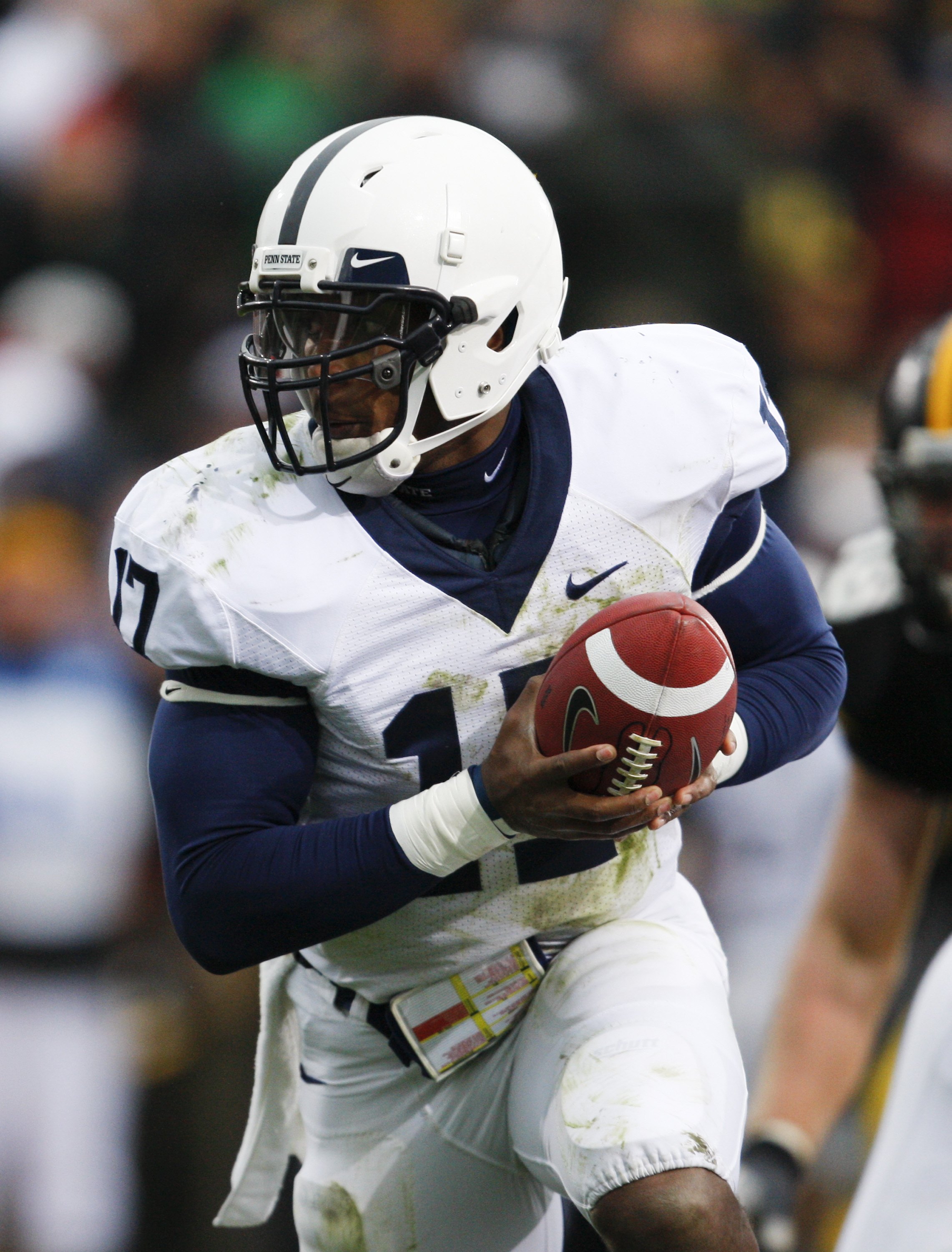
Do you like Penn State's road uniform?

[/B]
In a uniform we never really wore...


Photographic evidence says otherwise.
Likes:
Wyoming - They are true to their colors. I think the uniforms a fine.
Arizona State
Stanford
Nebraska - in the 80's when their helmets where kind of creamy
Florida State - in the 80's with all of their players had the short shirts and the players had mirrored lenses - Bad F'ing ***
Virginia Tech - their newest ones.
Penn State
Iowa - sorry but I think the tiger hawk makes it - one of the coolest logo's in the NCAA - I hate the crap out of Iowa too.
Wake Forest - Clean and sharp
Dislikes:
Texas Tech - I think they always look busy
Florida - Dumb helmet
Oregon - the gimmick is becomming their identity and it is getting old.
Tennesse with the different orange on the helmet and jersey and the dumb font for the last names. Different size font depending on the length of the last name. It used to be that way.
Michigan - sorry to a lot of you but dumb helmet.
Last edited:
Oregon..Number One

Also


Plus There New Crabon Fiber Helmets are sick
Those are absured....and ugly. They stole the Hawks shoulder wings from the 90's.
Last edited:
Do you like Penn State's road uniform?
No.
TarHeelHawk said:photographic evidence says otherwise

Completely different shade of gold. So now you're an ISU obsessed Hawk troll, AND you're color blind?
I normally hate Oregon uni's, but the one from Thursday night was REALLY good. Wish I could find a pic.
No.
Completely different shade of gold. So now you're an ISU obsessed Hawk troll, AND you're color blind?
You're right one is yellow, and one is actually gold. But they're exactly the same in design, striping, etc. Besides, aren't ISU's colors cardinal and gold?
You don't think those two pictures look similar? Just a little bit?
Last edited: