What about a white outline on the numbers? Or white numbers with yellow outline?
This is my wish also.
What is by far the sharpest looking color? White. It's not even close. Look how much everyone loves our white uniforms.
So why not have some of it in our home cardinal uniforms? I think that's what I like the most about Minny's uniforms. They really use white in everything, and it looks sharp IMO.
As an example, let's look at GB's home uniform jersey. How much worse would this look with just solid yellow numbers instead of white? That would be awful.
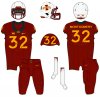
A few people wanted to see what our numbers might look like with white added.If we had white numbers, or even white trim around gold numbers, there would have to be some other obvious changes as well to make it look good. For instance, probably some white piping somewhere on the shoulders or sleeves, some gold and white stripes or something on the cardinal pants, and maybe also some gold and white stripes down the middle of the helmet too, in order to tie it together.
No way all of that happens, I know, so we're stuck with what we have. Maybe we could at least add a gold helmet, gold pants, and maybe some kind of striping on pants to tie in with jersey?