I don't mind the old logo. I just hate the boots. WTH does a bird need boots for? Talons look a lot cooler anyways.Yes I do and I have a Tat of it.
No forums found...
Site Related
Iowa State
College Sports
General - Non ISU
CF Archive
Install the app
Iowa State Uniform Discussions (update: new basketball unis)
- Thread starter CyTwins
- Start date
No forums found...
Site Related
Iowa State
College Sports
General - Non ISU
CF Archive
You are using an out of date browser. It may not display this or other websites correctly.
You should upgrade or use an alternative browser.
You should upgrade or use an alternative browser.
KidSilverhair
Well-Known Member
The head by itself is ... OK (although usually appears as part of "Toilet Cy," another Unfortunate Design Incident).I hate the fact that it looks like he's looking upward instead of forward. I get the perspective point that he's walking towards us, but....just, no.
Everything beyond the head -- E-gad. Another thing, does it seem like the outline is unnecessarily thick, relative to everything else?
Then we need better renderings. These guys wore a lot of yellow-gold and look pretty badass to me:
Wow! My freshman year. What a throwback.
What a find! The design is so hideously dated, it's magnificent!
Must have been made in 1979 (or shortly after). That's Walter Grant, wearing Duncan-era helmet, and Cy's chest has the ISU logo from late-70s (returned to that for helment in 1980 before reverting back to the swooshy-ISU).
EDIT: helmet is based on '81/'82 - first Duncan season had the ISU with star-over-I -- so Grant never wore the ISU helmet. So it's an era combo montage.
Last edited:
The yellow/gold/whatever of the late 70s is the proper color for ISU. The color of that helmet. The key is to get more white in the uniform, especially the home uniform. That breaks up the ketchup/mustard trope and looks a hell of a lot better.
View attachment 99389
It's funny how many people complain about the current helmet and jersey shades not matching, but then hold up the Earle Bruce era uniforms as fantastic.
Those 1970s uniforms had four different shades of "gold" -- helmet, jersey trim, number screen-print, pants.
Donnie Duncan era. I can't find the logo,....ISU
Dude- it was the 1970s.It's funny how many people complain about the current helmet and jersey shades not matching, but then hold up the Earle Bruce era uniforms as fantastic.
Those 1970s uniforms had four different shades of "gold" -- helmet, jersey trim, number screen-print, pants.
The classic simplicity is probably a big part of the appeal. That and those teams just played tough.
We used a True Gold/metallic gold as a helmet accent color in 2016. I would love to see a gold helmet using the colors that we see in the stripe and the logo here.At this point it would probably have to be an "Alternate Gold." I agree it would not be a great idea, nor really feasible for anything more than an alternate color scheme.
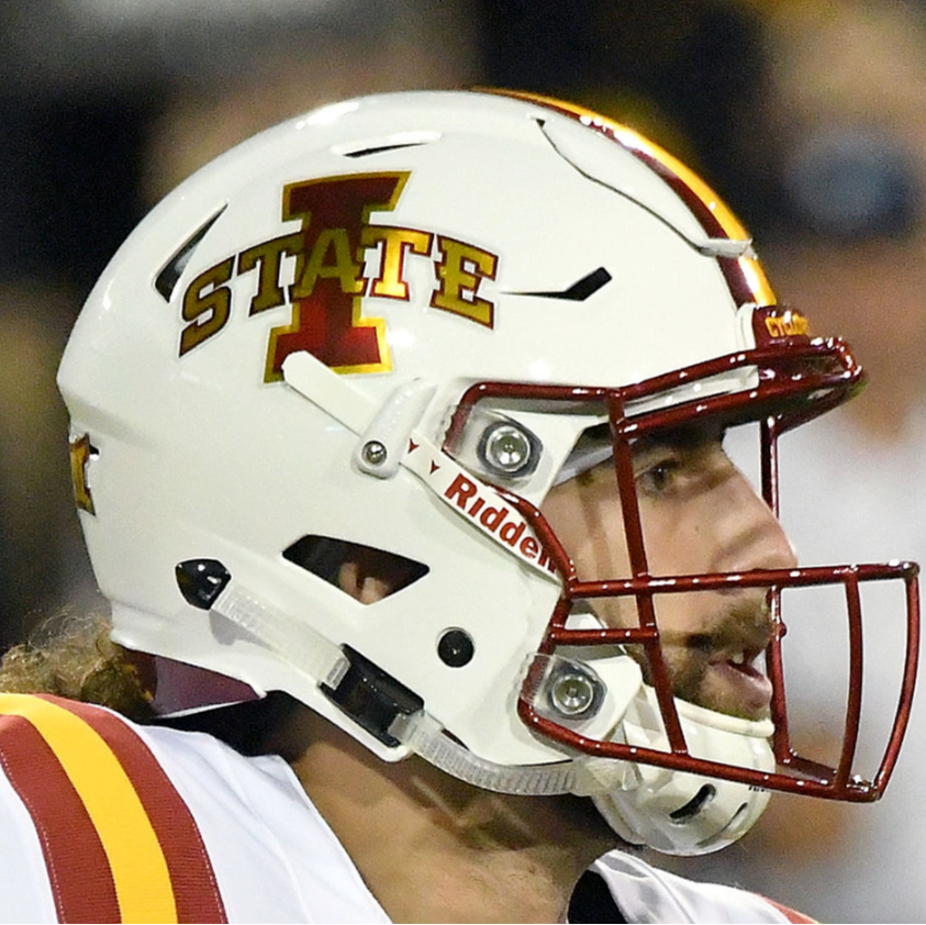
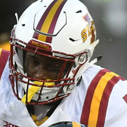
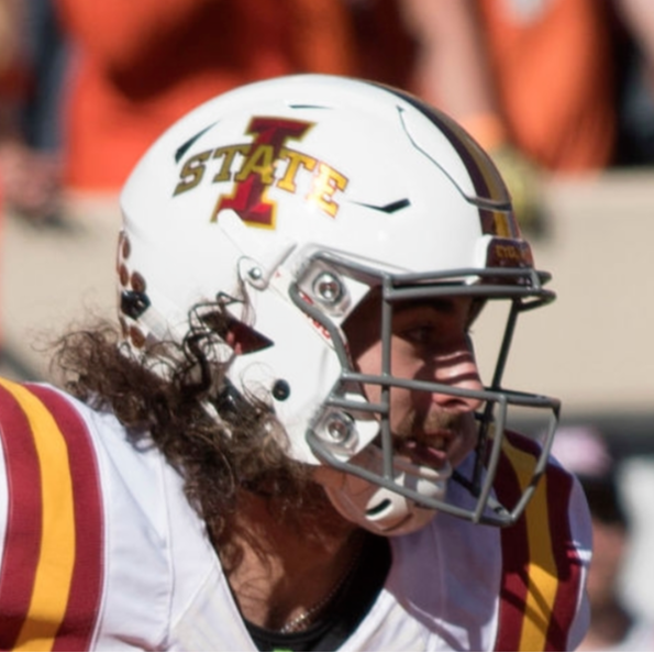
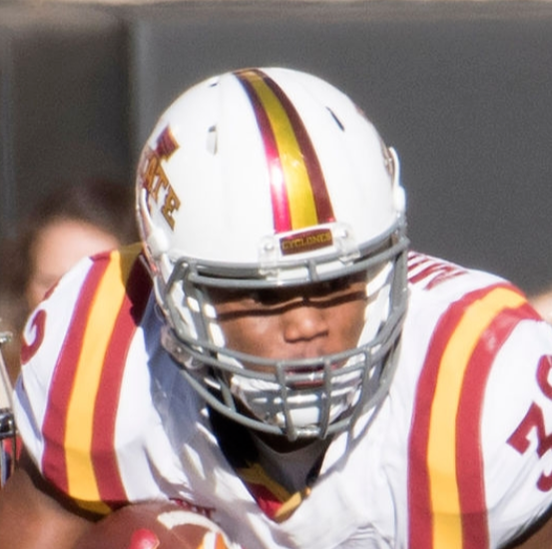
Also, this site has a pretty comprehensive list of the helmets that we have used in our history:
https://www.helmethistory.com/iowa-state.html
I knew Harry Burrell who new everything.GoldCy: I’m not asking “how do you know this” because I am doubting you, generally curious.
How do you know this? I appreciate this level of detail regarding history of Iowa State athletics.
I also saw them painting the helmets.
They need spurs to rip up hawks.I don't mind the old logo. I just hate the boots. WTH does a bird need boots for? Talons look a lot cooler anyways.
I agree with two. I really dislike that cy though.
I'm not exactly sure where I found this. But someone online, a Cyclone (Edit: Kagavi) made this regarding Cy/WalkingCy:You prefer the old one wearing clunky boots? The one I posted uses the head from McCarney’s blender bird.

I like it. I did mod the "I" some on the far right, new Walking Cy, to make it look better (made the bottom part of the "I", a little thicker).
Whomever did this, please let us know, so we can give credit.
I'm also not a huge fan of the current, 'official' Cy, or toilet bowl cy, yeah, that one.
Edit: this is an @Kagavi concept.
Last edited:
If they'd just consult with a few of us fans first (you/me, a few others LOL), they would have made better choices!The head by itself is ... OK (although usually appears as part of "Toilet Cy," another Unfortunate Design Incident).
Everything beyond the head -- E-gad. Another thing, does it seem like the outline is unnecessarily thick, relative to everything else?
And your point being?It's funny how many people complain about the current helmet and jersey shades not matching, but then hold up the Earle Bruce era uniforms as fantastic.
Those 1970s uniforms had four different shades of "gold" -- helmet, jersey trim, number screen-print, pants.
Does this demonstrate the fluctuation accurately? (Maybe the cardinal jersey differs)It's funny how many people complain about the current helmet and jersey shades not matching, but then hold up the Earle Bruce era uniforms as fantastic.
Those 1970s uniforms had four different shades of "gold" -- helmet, jersey trim, number screen-print, pants.

Viewing this version, definitely 3 golds - helmet, main pants color and the striping. Especially notable on the pants. Maybe the outline of numeral is the 4th, but looks close to the main pants tone.
These were an incredible failure -- especially for people whose job includes having to read the numbers (radio, TV, statisticians, etc.). Changing the jersey color to black wouldn't help that.
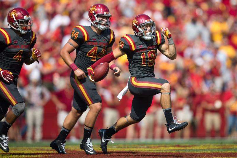
Just go black with yellow numbers instead of red, maybe just use white trim on the yellow, no red at all.
I like that Cy more than the one they made more straight up a while back, this one at least seems to merge the retro Cy with the Modern Cy. If we had to go with a modern design Cy this is the one I would go with. But I do prefer the retro ones overall.I agree with two. I really dislike that cy though.
I believe that was @Kagavi work there. Which has done a lot of excellent work.I'm not exactly sure where I found this. But someone online, a Cyclone, made this regarding Cy/WalkingCy:
View attachment 99396
I like it. I did mod the "I" some on the far right, new Walking Cy, to make it look better.
Whomever did this, please let us know, so we can give credit.
I'm also not a huge fan of the current, 'official' Cy, or toilet bowl cy, yeah, that one.
The yellow/gold/whatever of the late 70s is the proper color for ISU. The color of that helmet. The key is to get more white in the uniform, especially the home uniform. That breaks up the ketchup/mustard trope and looks a hell of a lot better.
View attachment 99389
It's funny how many people complain about the current helmet and jersey shades not matching, but then hold up the Earle Bruce era uniforms as fantastic.
Those 1970s uniforms had four different shades of "gold" -- helmet, jersey trim, number screen-print, pants.
I think the 70's gold we had (really 1967-1982) was about the same. There were some variations for sure, but probably most were unintended.Does this demonstrate the fluctuation accurately? (Maybe the cardinal jersey differs)
View attachment 99397
Viewing this version, definitely 3 golds - helmet, main pants color and the striping. Especially notable on the pants. Maybe the outline of numeral is the 4th, but looks close to the main pants tone.
There was definitely 3 shades of gold in some pics. Some pics, you could hardly tell if there was more than 2 shades, and the shades were very close.
Personally, I like 2-3 shades of gold, but that's just me. The 70's gold that we had, was Boss.
Here's a few more pics, from the mid 70's to the early 80's - (I may have to do a couple of posts, to keep the KB under the post maximum.)


