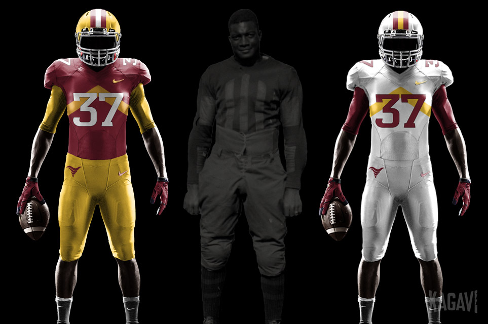
Iowa State Uniform Discussions (update: new basketball unis)

cyclones500

Well-Known Member
Jan 29, 2010
38,815
26,839
113
Michigan
basslakebeacon.com
I would say two reasons --

Monochromatic uniforms always look bad except for white over white.

Colored jerseys and pants should always contrast.

The boring plain white of the current pants does nothing to balance or complement the red helmets and red jerseys. The pants should be gold so they match the numbers on the jersey.

The design of the individual elements in the present uniforms are fine; they are just used together incorrectly and suffer from the lack of gold pants to round out the home uniform.

The road uniforms are much better, though, in whatever mixture (e.g., C/W/W, C/W/C, W/W/W, etc.).
I won't say monochrome is "always" bad, but generally not the strongest look in most cases, compared to what else would be available (not only ISU, but others).

You're spot-on with the majority of the points. Definitely has been discussed that the current combos for home don't have good tie-in and accent elements among white-cardinal-gold, so most either lack dynamic (C-C-C) or seem mismatched (C-C-W).

There's a reason the road combos work better, having the white jersey as a common element works much better with the white helmet/pants - and lack of gold isn't as noticeable since numerals are cardinal (so gold becomes accent-only).
 
Last edited:
  • Agree
Reactions: ABECyguy

JohnPrineforCy

Well-Known Member
Feb 1, 2019
994
2,592
93
37
I think the easiest way to fix the home uniform is to just make the numbers white with yellow trim. I already like the C/C/W combo. This would just tie it together better. I am also a fan of the solid color pants. Its just a very college thing.
 

Billups06

Well-Known Member
SuperFanatic
SuperFanatic T2
Apr 18, 2006
1,520
1,610
113
With all that being said about the simple changes I would make, I think this is the best uni in Iowa State history. If they went back to something like this you will never see me on this board again. View attachment 102268
I would love for our pants to have some other color/striping on them (much like the pants in the photo I’m quoting) rather than the current solid one-color. Makes it much easier to incorporate other uniform colors.
 
Last edited:

theshadow

Well-Known Member
Apr 19, 2006
19,976
19,638
113
I think the easiest way to fix the home uniform is to just make the numbers white with yellow trim. I already like the C/C/W combo. This would just tie it together better. I am also a fan of the solid color pants. Its just a very college thing.

Just take this, swap out the navy mask/accents, and update the logos. Problem solved.

oct-1996-running-back-troy-davis-of-the-iowa-state-cyclones-carries-picture-id72362055
 

CYCLNST8

Well-Known Member
Jul 19, 2008
11,368
13,517
113
Urbandale
www.gimikk.com
With all that being said about the simple changes I would make, I think this is the best uni in Iowa State history. If they went back to something like this you will never see me on this board again. View attachment 102268
I'm in the camp that believes 2 of 3 need to match; helmet & pants being the traditional combo that usually looks best. In this case, the pants should be red or gold and it'd look a lot better. I also prefer white numbers. This is my favorite uniform combo:

1661971732726.png
 
  • Like
Reactions: byebye

JohnPrineforCy

Well-Known Member
Feb 1, 2019
994
2,592
93
37
I'm in the camp that believes 2 of 3 need to match; helmet & pants being the traditional combo that usually looks best. In this case, the pants should be red or gold and it'd look a lot better. I also prefer white numbers. This is my favorite uniform combo:

View attachment 102269
I am also a big fan of those unis. They are a close 2nd. I know I am in the minority on this but I have always enjoyed the 3 different color combinations. Always liked druing the Rhoads era when our away uni was C/W/Y
 

theshadow

Well-Known Member
Apr 19, 2006
19,976
19,638
113
I'm in the camp that believes 2 of 3 need to match; helmet & pants being the traditional combo that usually looks best. In this case, the pants should be red or gold and it'd look a lot better. I also prefer white numbers. This is my favorite uniform combo:

View attachment 102269

And in true ISU fashion, that touchdown got called back on a penalty.

The G/C/C was rare, since in that set the red pants only existed in '93 and '94.
 
  • Like
Reactions: cyclones500

Sigmapolis

Minister of Economy
SuperFanatic
SuperFanatic T2
Aug 10, 2011
26,930
41,630
113
Waukee

Seeing NFL players wearing matching jerseys/pants/socks just makes me want to hurl. The Saints' have such beautiful gold pants but, instead, they look like they're wearing yoga pants.

I love yoga pants as much as the next honest red-blooded American man, but not on male athletes.

Our cardinal and gold together with nothing to break them up is a bad look. It's why we've had a lot of jersey issues, you know, other than all the losing. If you add just a little white to the home jerseys, it gets a lot easier to make the cardinal on gold work.

I don't mind monochromatic if there is a little gold on the pants. Otherwise, I agree that our pants do nothing to work with the rest of the jersey. The tiny I-State logo doesn't do anything.

I am still going to disagree with you on the mono look, but I do agree with you the depressingly plain pants... they look like something they'd wear at practice... are really the problem here.

I won't say monochrome is "always" bad, but generally not the strongest look in most cases, compared to what else would be available (not only ISU, but others).

You're spot-on with the majority of the points. Definitely has been discussed that the current combos for home don't have good tie-in and eaccent elements among white-cardinal-gold, so most either lack dynamic (C-C-C) or seem mismatched (C-C-W).

There's a reason the road combos work better, having the white jersey as a common element works much better with the white helmet/pants - and lack of gold isn't as noticeable since numerals are cardinal (so gold becomes accent-only).

I wish they'd pull an LSU and just wear white at home. It looks so much better in any combo.

I think the easiest way to fix the home uniform is to just make the numbers white with yellow trim. I already like the C/C/W combo. This would just tie it together better. I am also a fan of the solid color pants. Its just a very college thing.

I still see it as more of a high school thing. The fact that design trend crept "up" from high school into college and the NFL annoys me. Zero NFL teams did it until the past decade.
 
  • Winner
Reactions: 1UNI2ISU

cyclones500

Well-Known Member
Jan 29, 2010
38,815
26,839
113
Michigan
basslakebeacon.com
I wish they'd pull an LSU and just wear white at home. It looks so much better in any combo.
I might not go full-on LSU-home-white concept, but I do think one game per season with cardinal-white-cardinal at home would be sharp.

One choice for uniform contrast would be when CyHawk game is at home. (And it gives a mini-nod to tradition of the series, without it being full-on "huge game")

Alternate seasons select it for some other opponent, depending how the slate falls.
 

KidSilverhair

Well-Known Member
Dec 18, 2010
11,070
21,741
113
Rapids of the Cedar
www.kegofglory.blogspot.com
I won't say monochrome is "always" bad, but generally not the strongest look in most cases, compared to what else would be available (not only ISU, but others).
It’s almost always bad, and it almost always looks like pajamas.

Those NFL ColorRush uniforms are hideous.
 
Last edited:

Nor'MidWester

Well-Known Member
Sep 25, 2016
1,812
2,633
113
Our cardinal and gold together with nothing to break them up is a bad look. It's why we've had a lot of jersey issues, you know, other than all the losing. If you add just a little white to the home jerseys, it gets a lot easier to make the cardinal on gold work.

I don't mind monochromatic if there is a little gold on the pants. Otherwise, I agree that our pants do nothing to work with the rest of the jersey. The tiny I-State logo doesn't do anything.
That's why adding bits of white to the uniform is so important.
I mean not actually important it's just a sports uniform but important in making the uniform's look their best.
 

CyNews

Well-Known Member
Mar 19, 2021
2,354
2,028
113
68
1) The JTS pressbox is outdated and inadequate, bring back the Clyde Williams pressbox! :jimlad:

2) Back in the days before consolidation/marketing of school media rights, when any radio station that wanted to be there could send their own announcers to cover a game (I see banners from KRNT and KMA, plus another one I can’t read)
Could be WOI or KMA or KPGY.
 

cyclones500

Well-Known Member
Jan 29, 2010
38,815
26,839
113
Michigan
basslakebeacon.com
It’s almost always bad, and it almost always looks like pajamas.

Those NFL ColorRush uniforms are hideous.
It can look OK at times, but it works best if the general design includes traditional striping (double-stripe, ideally) in the helmet, sleeve/shoulder and pants. That gives it a little "relief."

I think when it's full-on primary + numeral with no trim at all, it's dull. Exceptions do apply, although I can't think of specific examples.

But that's, like, just my opinion, man.