This! Indiana doesn't have a front plate and it looks so much cleaner and nice. I can't figure out a real legitimate reason for needing a front plate either.
It's a nice spot for the state patrol to tag you with their laser radar.

This! Indiana doesn't have a front plate and it looks so much cleaner and nice. I can't figure out a real legitimate reason for needing a front plate either.
And they still look stupidYeah......on all my vehicles.....don't do that Iowa. (disclaimer, the real ones were redesigned with lesser pornographic image)
I'd say get rid of the county name on the plate. I've never seen this done anywhere else and I'm not sure the point.
I really like that part of our plate. I think it's interesting to see where people are fromI'd say get rid of the county name on the plate. I've never seen this done anywhere else and I'm not sure the point.
I'd say get rid of the county name on the plate. I've never seen this done anywhere else and I'm not sure the point.
I just looked it up 6/50 have county name and in FL it's an option. I'm sure it doesn't happen a lot but I feel like you can potentially be targeted with county names. Like a polk plate in a really rural county or vice versa. Or story county in IC.
I thought of that, but If there is any sort of county identifier on the plate that's still an issue. If they were numbers in the corner, common numbers are easy to identify too.
The green 1970s plates and blue 1980s plates had county coding built in, in addition to the specific county name being shown. ... Before that, the county number (Story = 85) was stamped on the plate with no separate county name listed.
A license plate that just reads "72GR391" (for example) with no county name means nothing unless someone knows all 99 Iowa counties in alphabetical order. If they do, then I'll just tip my cap and go about my business.
I liked Oregons the best.Related: Hadn't encountered this previously, about 3 years ago designers from each state collaborated on State Plates Project, re-imagining each U.S. license plate. Some look sharp, some are overdone or too busy. Maryland's is the dumbest idea I've ever seen.
Warning: Concept for Iowa plate has a slogan and color scheme that most of us here will find unacceptable (simplicity of the design itself isn't too bad, though).
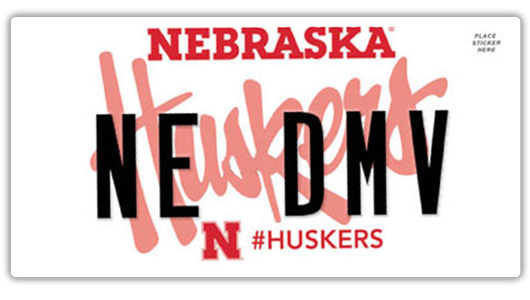
Pray they don't change the ISU plates. They changed the university plates in Nebraska as well as the normal plates. The UNL plates are terrible. This image doesn't show how bad they really are. The "Huskers" is actually much darker and makes it that you can't read "Huskers" or the plate number. It just looks like a scribbled mess.Personally I don't care about the re-design, as long as I can keep getting my ISU plates I don't care what the other plates look like.