White Helmets!!

t-noah

Well-Known Member
Feb 2, 2007
19,780
13,415
113
From Cyclone Uniforms@CycloneUniforms
attachment.php
attachment.php
attachment.php

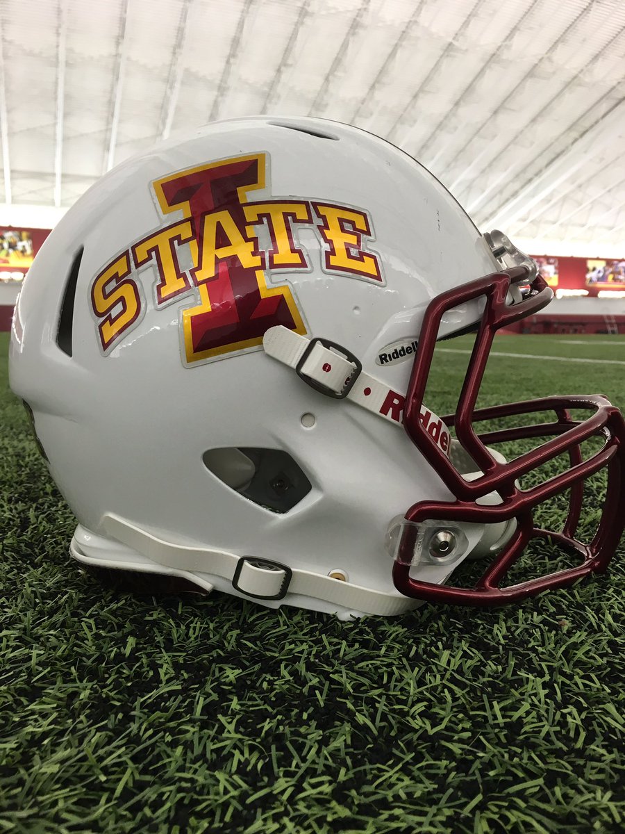
Not saying these are 'official' for this year, as this site does some pretty far out mock-ups also. I have to say that the Home unis here above, w/ the white helmet, don't look nearly as bad as the pic here, below. The new helmet stripe does look good! Hopefully they will release a Red helmet "alternate"? We'll see.
attachment.php
 

Attachments

  • Cyclone Uniforms ?@CycloneUniforms  Jun 6, 222.jpg
    Cyclone Uniforms ?@CycloneUniforms Jun 6, 222.jpg
    101.4 KB · Views: 574
  • Cyclone Uniforms ?@CycloneUniforms  Jun 6, 333.jpg
    Cyclone Uniforms ?@CycloneUniforms Jun 6, 333.jpg
    98.6 KB · Views: 586
  • Cyclone Uniforms ?@CycloneUniforms  Jun 6.jpg
    Cyclone Uniforms ?@CycloneUniforms Jun 6.jpg
    97.3 KB · Views: 586
  • isu uni 3.jpg
    isu uni 3.jpg
    18.4 KB · Views: 577

cyclones500

Well-Known Member
Jan 29, 2010
38,858
26,898
113
Michigan
basslakebeacon.com
We're on the same page...I find it so irritating the way the red logo gets lost on the red helmet.

It has gradually become irritating to me, too.

When current FB uniform set was unveiled, I liked it almost immediately. I noticed the iffy-contrast on the helmets pretty quickly, but I mostly ignored it because I thought the full concept was pleasing.

Maybe I just zoomed in on the least-appealing aspects after a while. The too-close-to-USC argument has validity, but mostly bothered me less than the contrast problem.

It's unfortunate, because I dig the I-State logo design as "collegiate branding," but it's obvious the finer points of the new log were designed mainly to be viewed with white background, and not easily adaptable to either cardinal or gold backdrop. Note how the "I" is 2-tone red w/ gold outline, the "STATE" is gold with red outline.

Yep, I know I'm not the first person who noticed or mentioned that — it took me a lot longer to realize and explain it.

:smile:
 

Cydkar

Well-Known Member
Apr 12, 2006
26,922
12,722
113
The most popular helmet with the youngest generation here at my place remains the 2000 helmet.
attachment.php


I believe, based on the marker number written inside, that it was JaMaine Billups helmet. Picture is NOT JaMaine. :)

What a horrible helmet that was. I still want to hear the story of how we got blue in there.
 

jkclone

Well-Known Member
Bookie
Jan 21, 2013
5,834
2,360
83
Urbandale
What a horrible helmet that was. I still want to hear the story of how we got blue in there.
I think a modified version would be good. Use the updated logo and you eliminate the blue that everyone always complains about.
 

BoxsterCy

Moderator
Staff member
Sep 14, 2009
48,387
47,305
113
Minnesota
The white helmets success will be judged on whether we end up with a Cyclone with a white helmet nickname along the lines of Billy "White Shoes" Johnson.
 

goldmember

Well-Known Member
May 31, 2006
1,514
258
83
The two color "I State" logo looks great. The 4 color "I State" logo clashes because the bright Cardinal doesn't match anything.
 

BWRhasnoAC

Well-Known Member
SuperFanatic
SuperFanatic T2
Apr 10, 2013
30,229
27,898
113
Dez Moy Nez
I would love for those three combinations to be our new uniforms. Those are sharp, simple, and don't modify the colors and current branding by much. Would be exciting to see this happen.
 

cy4life94

Well-Known Member
SuperFanatic
SuperFanatic T2
Sep 26, 2012
603
292
63
Cedar Rapids
I think we could have some pretty cool uniforms if we went with the all white ones but took the yellow out and replaced it with white. I know we would be leaving out one of our main colors but I think it would look sweet. Could anybody work up what that would look like.
 

CYCLNST8

Well-Known Member
Jul 19, 2008
11,370
13,520
113
Urbandale
www.gimikk.com
I think we could have some pretty cool uniforms if we went with the all white ones but took the yellow out and replaced it with white. I know we would be leaving out one of our main colors but I think it would look sweet. Could anybody work up what that would look like.

No. You wanna look like the fuskers??
 

everyyard

Well-Known Member
SuperFanatic
SuperFanatic T2
Nov 24, 2006
8,222
3,641
113
48
www.cyclonejerseys.com
Cute kid but those helmets are HORRIBLE. I went to ISU during this era and the colors of the uniforms/equipment/tshirts etc. are just awful. Possibly the worst of all time.

Blue with our Cardinal and gold colors could be pulled off with some tweaks...see New Belgium or Cavs...we just failed. Plus the logo was dated and ****.
 

t-noah

Well-Known Member
Feb 2, 2007
19,780
13,415
113
To be clear, I don't think they can do this for this year (I don't think so anyway), but here is what this set might look like with a little white accent. Next year I think they will go for a re-design, but I'm not sure.
attachment.php
attachment.php
attachment.php
 

Attachments

  • Cyclone Uniforms ?@CycloneUniforms  Jun 6, 222.jpg
    Cyclone Uniforms ?@CycloneUniforms Jun 6, 222.jpg
    101.4 KB · Views: 370
  • Cyclone Uniforms ?@CycloneUniforms  Jun 6 333, white stripe.jpg
    Cyclone Uniforms ?@CycloneUniforms Jun 6 333, white stripe.jpg
    123.9 KB · Views: 373
  • Cyclone Uniforms ?@CycloneUniforms Jun 6, white.jpg
    Cyclone Uniforms ?@CycloneUniforms Jun 6, white.jpg
    125.8 KB · Views: 371

t-noah

Well-Known Member
Feb 2, 2007
19,780
13,415
113
Nothing wrong with our logo on red, if done like this:
attachment.php
It's not like they won't do this again, but please, no matte lid again! This is better, in gloss or semi-gloss, IMO, of course.
attachment.php
This, or the stencil above would be a great 'alternate'.
 

Attachments

  • isu helmet Cyclone Uniform guy stencil flip color on red, 111.jpg
    isu helmet Cyclone Uniform guy stencil flip color on red, 111.jpg
    99.6 KB · Views: 364

t-noah

Well-Known Member
Feb 2, 2007
19,780
13,415
113
I'm going to go out on a limb, and say this is what we will have for this year, and I'm OK w/ it. Of course I had to make a little 'commentary'! I still think we could get some alternate Red lids this year. I have no idea if we will stay w/ White lids only. :unsure:
attachment.php
attachment.php
attachment.php
 

Attachments

  • Cyclone Uniforms ?@CycloneUniforms  Jun 6 222, com.jpg
    Cyclone Uniforms ?@CycloneUniforms Jun 6 222, com.jpg
    133.7 KB · Views: 352
  • Cyclone Uniforms ?@CycloneUniforms  Jun 6 333, com.jpg
    Cyclone Uniforms ?@CycloneUniforms Jun 6 333, com.jpg
    132.3 KB · Views: 345
  • Cyclone Uniforms ?@CycloneUniforms  Jun 6, com.jpg
    Cyclone Uniforms ?@CycloneUniforms Jun 6, com.jpg
    133.6 KB · Views: 350

cyclones500

Well-Known Member
Jan 29, 2010
38,858
26,898
113
Michigan
basslakebeacon.com
The two color "I State" logo looks great. The 4 color "I State" logo clashes because the bright Cardinal doesn't match anything.

I'd have to see verification of this claim in graphic form, specifically, but it sounds like it has validity. Similarity with what I attempted to say in my previous post.

Did the beveling effect along with the 2-tone gold & cardinal make it more problematic to adapt it to any possible helmet background involving gold, cardinal, white?
 

NetflixAndClone

Well-Known Member
Sep 6, 2015
5,634
7,457
113
The State of Hockey
I'm going to go out on a limb, and say this is what we will have for this year, and I'm OK w/ it. Of course I had to make a little 'commentary'! I still think we could get some alternate Red lids this year. I have no idea if we will stay w/ White lids only. :unsure:
attachment.php
attachment.php
attachment.php
While I'd prefer this, I still think we will be wearing the ketchup and mustard look most of the time. I think the away games we will wear white helmets 80% and home games we might wear it once.

and I'd hope we would shake it up and wear them every game like these but I highly doubt it.
 

jdoggivjc

Well-Known Member
Sep 27, 2006
61,630
23,889
113
Macomb, MI
Nothing wrong with our logo on red, if done like this:
attachment.php

I think the "stencil" looks good on the matte helmet, but I'd like to see how the new "metallic" logo looks on our standard cardinal helmet (I'd also like to see the chromed red facemask and tapered stripe on that helmet as well)

CkTCqUUUgAAqlki.jpg


I'm pretty sure I've already said this, but I can't wait until they start selling minis of the white helmet. I'll have to buy two - one for my office, one for my home office/man cave.
 

Latest posts

Help Support Us

Become a patron