No forums found...
Site Related
Iowa State
College Sports
General - Non ISU
CF Archive
Install the app
New Uniforms Revealed
- Thread starter CyTwins
- Start date
No forums found...
Site Related
Iowa State
College Sports
General - Non ISU
CF Archive
You are using an out of date browser. It may not display this or other websites correctly.
You should upgrade or use an alternative browser.
You should upgrade or use an alternative browser.
It's not like the current angry Cy, or whatever it's called, is any good, definitely not great. So Coaches choose from the past, of which we have many better logos to choose from?What in the absolute ****. Out of all our millions of iterations of logos, that is absolutely 1 or 2 for the worst ever. We waste walking Cy, leaning Cy, sports-specific Cy, scripts, trice 5-bars for that monstrosity?
Might as well just make a few of the old ones alternate logos. We have a couple that each of us like, I think.
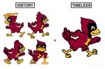
While at it, make the Orrnado, or Walking Cy, or both, an official primary. Here's a very slight Walking Cy mod I did [SIAP], with two head choices (Angry and Happy Cy)(see the modification of black around the eyes and neck, similar to Leaning Cy), both with boots (which I prefer), and the image from Kagavi (which inspired it).


my guess is that they're just following the trends. that logo from the mccarney era is all over apparel on campus. seems like the more 90s, the better for these kids. if you look at the crowd shots during games you'll see an unsettling amount of kids wearing shirts with that gross wreath thing that used to be an overused design element.Spitballing here, but I know CMC thinks very highly of Dan McCarney. This is callback to his era, and that’s nostalgic for a sizable chunk of our fanbase too.
I’m hoping this opens door for other older (and better) logos in an official capacity.
Our 90's logo package, and this St. Johns logo package - were f***ing awesome, and are still awesome.Because it was a little too much like the St. John's logo, which came out the year prior and was designed by the same company?


Busy next 7-10 days coming up of NFL uniform releases. Jets 1st up:
Busy next 7-10 days coming up of NFL uniform releases. Jets 1st up:
I like em, especially that helmet logo they've been using. Still they have better logos from the past.
The throwback bars on the shoulder is classic but every team doing it now but it's still better than what they had the last few seasons, the pointy stripe thing.
Browns going back to the Glossy Helmet and white facemask:
Browns going back to the Glossy Helmet and white facemask:
Seems so obvious, gotta question why they ever went away from it.
Browns going back to the Glossy Helmet and white facemask:
 ~ I'm Matt Campbell and I approve this message.
 Pollard confirmed on the radio today that this was NOT an April Fools Joke. There are indeed new uniforms coming. He said he didn't know (or want to say) when they would be fully released to the public though.
I wouldn't be surprised if they did it Saturday at/during the Spring Game though.
I wouldn't be surprised if they did it Saturday at/during the Spring Game though.
I'm a simple man, whenever i see tertiary blue and blender cy at the ISU bookstore I buy it.
Busy next 7-10 days coming up of NFL uniform releases. Jets 1st up:
If only the Jets were as good as their uniforms look. One of the best uniforms in the NFL IMO.
Pollard confirmed on the radio today that this was NOT an April Fools Joke. There are indeed new uniforms coming. He said he didn't know (or want to say) when they would be fully released to the public though.
I wouldn't be surprised if they did it Saturday at/during the Spring Game though.
They better be good. Because usually most fans using rudimentary photoshop skills can come up with uniforms that look way better than what our athletic dept does.
I see the Jets get input from the fans. Wonder why we don't?
Every time I get a notification for a new post on this thread, I'm just hoping the new uniforms have been revealed 
Every time I get a notification for a new post on this thread, I'm just hoping the new uniforms have been revealed
I'm cautiously optimistic they will be a big improvement... but not holding my breath.
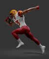
The only thing we've been shown so far is just the stripes, correct? Everything else that's been on here is just what fans think they might look like. Like the white numbers for instance. We don't know for sure if that will be the case yet, right? I hope so. We desperately need white numbers on the cardinal jerseys.
It HAS to be the 5-bar logo on the arms, not horizontal stripes that mean nothing. Lets start building some consistency and brand recognition. People outside of CF are just learning what the 5-bar logo means and that it's related to ISU.... so of course we want to pass up an opportunity to put it very prominently on the shoulder plads instead of some crappy ass stripes.
/passionate preach
/passionate preach
Is that high top hair cut's gravity warping space time? Look at the distortion in the stands.Go a few years forward.

Now the Vikings need to go back to glossy. Their matte looks to Easter-y purple to me, BRING BACK THE EGG PLANTSeems so obvious, gotta question why they ever went away from it.


