No forums found...
Site Related
Iowa State
College Sports
General - Non ISU
CF Archive
Install the app
New Uniforms Revealed
- Thread starter CyTwins
- Start date
No forums found...
Site Related
Iowa State
College Sports
General - Non ISU
CF Archive
You are using an out of date browser. It may not display this or other websites correctly.
You should upgrade or use an alternative browser.
You should upgrade or use an alternative browser.
We are waiting on you!What about the pants? Pretty sure they're incorporating white into the home jerseys so they don't clash so much with the white pants. I'm surprised one of you Photoshop experts haven't given us a full uniform mockup yet (I doubt anything is changing with the helmet other than using a white chinstrap with the red lids).
Man, third version in both rows look sharp.
I think it’s because they’re so stupid is why I like them. I’m someone who likes the purple Barney Vince Carter raptors jerseys and the old hornets jerseys and stuff like that. Think these fit in with that stupid 90s style, kinda along with the whirlybird unis we hadReally?!?! I have always thought these are dumbest looking unis I have ever seen.
They look like they are trying to put bumble bee wings on them.
View attachment 126925
I've been saying the 5-bar logo makes so much more sense than horizontal stripes. People outside the diehards are just learning about the 5-bar/Trice logo and attributing it to ISU. Why not capitalize on that rather than stupid horizontal stripes that don't represent anything?
Agree it'd make sense to Trice-stripe on the sleeve. My first inkling when I saw the prototypes revealed was the striping is a horizontal representation of Trice stripes ... mixing trad-sleeve design with the emblem.
Total guess on my part.
If that's the goal then you might as well just go with Trice logo.
Brent, I think this link is kinda hidden. I couldn't find it elsewhere, just now.
I would suggest making a thread for it, in BB and FB.
I would say just add some cardinal trim and no gold. Similar to what Stanford did.Just add a little cardinal and gold to the black and white. Something like below (don't judge my horrible skills)...
View attachment 126869

I like our football and bball jerseys, but both need a refresh.
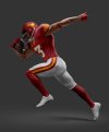
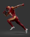
What about the pants? Pretty sure they're incorporating white into the home jerseys so they don't clash so much with the white pants. I'm surprised one of you Photoshop experts haven't given us a full uniform mockup yet (I doubt anything is changing with the helmet other than using a white chinstrap with the red lids).

The fanbase out east wants these beauties back! View attachment 126930
No word on whether or not monkeys get rhabdo.
i agree...it will be impossible to look distinct/unique if you limit yourself to regular horizontal sleeve stripes. if we want to be different with the sleeves we need to throw the trice stripes on there or improve upon our current 'tornadic' sleeve design or something.
View attachment 126915 View attachment 126916
I wonder whether the full sleeve might have a Trice Stripes look to them.
That's exactly what I've been begging for in terms of shoulder pads, 5-bar instead of horizontal stripes.
Great work!
It is WAY too KC Chiefs for me though. Is that our cardinal?
And I love the logo on the helmet, but it will likely NEVER happen. Can you put the I-STATE logo on there…. with the “I” in gold and the STATE in white and outlined in gold?
i realize the chiefs have similar pants to this, but just like the conversation about the sleeve stripes i think that erring on the side of a more classic look will mean some unavoidable overlap with other teams.Great work!
It is WAY too KC Chiefs for me though. Is that our cardinal?
And I love the logo on the helmet, but it will likely NEVER happen. Can you put the I-STATE logo on there…. with the “I” in gold and the STATE in white and outlined in gold?
'is that our cardinal?' is a tough thing to answer. our pantone colors are not the same as our jersey colors are not the same as our helmet colors are not the same as the sleeve stripe colors in the most recent twitter tease etc. combine that with different kinds of lighting, indoor v. outdoor, etc. and you have something that's virtually impossible to consistently depict. and i know that people will want to see a bunch of iterations and tweaks anyway so this was version one of many.
i realize the chiefs have similar pants to this, but just like the conversation about the sleeve stripes i think that erring on the side of a more classic look will mean some unavoidable overlap with other teams.
'is that our cardinal?' is a tough thing to answer. our pantone colors are not the same as our jersey colors are not the same as our helmet colors are not the same as the sleeve stripe colors in the most recent twitter tease etc. combine that with different kinds of lighting, indoor v. outdoor, etc. and you have something that's virtually impossible to consistently depict. and i know that people will want to see a bunch of iterations and tweaks anyway so this was version one of many.
Just seems like everything is cyclical in uniforms. We used to have white numbers, we used to have more striping, etc…. and everyone wanted something different. Now it seems everyone wants to go back to that again.
People didn’t like the McDonald’s bright red and yellow…. and now it looks like we’re kinda headed back in that direction again.
I do think having more white is needed though. The numbers, and a gold/white/gold stripe down the middle of the helmet.
I really hope the ISU men basketball will ditch the all yellow uniforms. It's way too much yellow.
No no. They need to get rid of the logo in the center and go with a script Cyclones. All yellow in basketball is terrific.I really hope the ISU men basketball will ditch the all yellow uniforms. It's way too much yellow.
How are those Chiefs other than we almost share their colors. Our cardinal is darker. The pant stripe? Otherwise, those jerseys are not similar at all.Great work!
It is WAY too KC Chiefs for me though. Is that our cardinal?
And I love the logo on the helmet, but it will likely NEVER happen. Can you put the I-STATE logo on there…. with the “I” in gold and the STATE in white and outlined in gold?
I don't think we're headed back to the red/yellow of McCarney/ChizikJust seems like everything is cyclical in uniforms. We used to have white numbers, we used to have more striping, etc…. and everyone wanted something different. Now it seems everyone wants to go back to that again.
People didn’t like the McDonald’s bright red and yellow…. and now it looks like we’re kinda headed back in that direction again.
I do think having more white is needed though. The numbers, and a gold/white/gold stripe down the middle of the helmet.
Just seems like everything is cyclical in uniforms. We used to have white numbers, we used to have more striping, etc…. and everyone wanted something different. Now it seems everyone wants to go back to that again.
People didn’t like the McDonald’s bright red and yellow…. and now it looks like we’re kinda headed back in that direction again.
I do think having more white is needed though. The numbers, and a gold/white/gold stripe down the middle of the helmet.


