No forums found...
Site Related
Iowa State
College Sports
General - Non ISU
CF Archive
Install the app
*New Uniform Thread*
- Thread starter DesertClone1
- Start date
No forums found...
Site Related
Iowa State
College Sports
General - Non ISU
CF Archive
You are using an out of date browser. It may not display this or other websites correctly.
You should upgrade or use an alternative browser.
You should upgrade or use an alternative browser.
An 89 page thread about our possible new uniforms and this is what we get; a cornucopia on the helmet and an ugly shade of gray pants. Only all gray would have been worse.
I am so happy, not, a nat'l prime time coverage game was chosen for the reveal.
And then we lose to boot
I am so happy, not, a nat'l prime time coverage game was chosen for the reveal.
And then we lose to boot
How ****ing hard is it to put the '80s tornado on the ****ing helmet. I swear to God this athletic dept could **** up a wet dream.
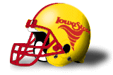
The helmet logo fails in multiple ways.
1. Third-grade rendering of a funnel cloud — and it isn't even "good cheesy-simplistic."
2. Has no connection to ISU branding, present or past.
3. Tornado is spiraling toward back of helmet — suggests we're running for cover.
4a. Poor contrast with base helmet color (a continual blind spot for ISU's design department, dating to McCarney era).
4b. Could work on a white helmet, but then it'd be easier to see how awful it is.
The helmet logo fails in multiple ways.
1. Third-grade rendering of a funnel cloud — and it isn't even "good cheesy-simplistic."
2. Has no connection to ISU branding, present or past.
3. Tornado is spiraling toward back of helmet — suggests we're running for cover.
4a. Poor contrast with base helmet color (a continual blind spot for ISU's design department, dating to McCarney era).
4b. Could work on a white helmet, but then it'd be easier to see how awful it is.
How many people had to sign off on this? A lot, I'm assuming. Yesterday was a bad, bad day for the football program.
Just hot garbage.The helmet logo fails in multiple ways.
1. Third-grade rendering of a funnel cloud — and it isn't even "good cheesy-simplistic."
2. Has no connection to ISU branding, present or past.
3. Tornado is spiraling toward back of helmet — suggests we're running for cover.
4a. Poor contrast with base helmet color (a continual blind spot for ISU's design department, dating to McCarney era).
4b. Could work on a white helmet, but then it'd be easier to see how awful it is.
PUT THE '80's TORNADO ON THE GOD DAMNED HELMET.
More than one person around me said it looked like a bugle snack chip...but it truly looked more like an upside down poo emogee.
F***ing terrible.
I was searching for a suitable face palm gif and none of them do justice. I cannot facepalm myself hard enough. The only thing worse than the logo was the offensive play calling.
Throw that logo away into a deep abyss never to be seen again. Unfortunately it was on national tv and now that will be the logo ESPN uses behind the I-State logo. It is now considered a bad luck image after that offensive showing. We have the original I-State logo from the 70's, the 80's tornado, and the walking cy. Those are pretty solid logos that could use a modern face lift. Start with that.
If we absolutely need to add another logo. Since the University of Iowa stole the State of Iowa's nickname as their nickname, we should take the outline of the state in cardinal and gold as our secondary logo. Keep it simple and meaningful while sticking it to the team out East. Just like I cringe when I hear Iowa referred to as the Hawkeye state. Now they won't be able to look at a map without cringing.
To me it just looks like a generic tornado clip art, nothing really jumps out to me telling me its a logo for Iowa State besides the color scheme. Someone not familiar with Iowa State will not immediately realize that is supposed to be an Iowa State "cyclone", but I guess that probably happens with all new logos. I feel like it needs to be more unique, idk.
View attachment 50285
It's taken me 5 minutes to do all this and its already better than what we wore.
SMH.
I have a T-shirt person...
The Criner era logo:Is there another tornado logo I don't know about?

OK. Now that the game with Texas is over:
"New" logos looks a lot like that Criner era logo which to me and a significant number of Alumni looks like failure. Get rid of it NOW!
2. This new coach takes far too long to adapt his players to the reality of the situation. Hell, even Rhoads who some say can't coach, had victories vs Texas (of course, this was when Herman was OC... which leads to a whole different convervsation..).
Anyhow, very disappointed with the outcome of the game vs Texas. Hardly any offense, very good defense vs a Texas team that hasn't shown a lot of offense. Not a good scenario for ISU... OOops sorry to go off on the logo thread.
The fact that football sucked during Criner shouldn't be a knock on the best logo we've attempted because the sucking was not unique to Criner's era.
The Criner era logo:

I know it's my avatar. He said it reminded him of that logo, but they're not really that similar so I was curious if there was another tornado logo he was referring to.
I know it's my avatar. He said it reminded him of that logo, but they're not really that similar so I was curious if there was another tornado logo he was referring to.
Perhaps the one in my sig? Basically the same logo minus the Iowa State script.
The Walden Era of Sucking:The fact that football sucked during Criner shouldn't be a knock on the best logo we've attempted because the sucking was not unique to Criner's era.


