
No forums found...
Site Related
Iowa State
College Sports
General - Non ISU
CF Archive
Install the app
*New Uniform Thread*
- Thread starter DesertClone1
- Start date
No forums found...
Site Related
Iowa State
College Sports
General - Non ISU
CF Archive
You are using an out of date browser. It may not display this or other websites correctly.
You should upgrade or use an alternative browser.
You should upgrade or use an alternative browser.


I liked the W-W-C, and I said it before, that'd be regardless of association with the upset.
It was even sweeter since OU unveiled all-crimson combo and did a crimson/crream crowd-striping for the game. Pulled out all the stops, probably assuming a major beatdown — then lost.
Sans introduction of a gold helmet this season (still waiting!!), I'd like to see white-cardinal-gold vs. Kansas.
It was even sweeter since OU unveiled all-crimson combo and did a crimson/crream crowd-striping for the game. Pulled out all the stops, probably assuming a major beatdown — then lost.
Sans introduction of a gold helmet this season (still waiting!!), I'd like to see white-cardinal-gold vs. Kansas.
That look on Saturday is a keeper. Our uniforms popped on television and nobody could mistake our helmet logo this time. In my opinion, this looked big time and our uniforms lit up the screen.
Besides the helmet, the upset in Austin was this combo as well if I remember right
Pretty sure it was C-W-C.
Yes. It also did not have the stripe that ends in a point in the back. Just a plain white helmet with decals and a white facemask.I thought the logo looked a little more flashy than usual? Was it a 'chrome' decal?
That look on Saturday is a keeper. Our uniforms popped on television and nobody could mistake our helmet logo this time. In my opinion, this looked big time and our uniforms lit up the screen.
since Oklahoma was wearing all red how will the old people know who Iowa State was playing?!
I'd like to see white-cardinal-gold vs. Kansas.
That would look terrible. That combo is the reason we initially rejected the white helmets:
I love the white helmets, with or without the stripes. The white makes the logo pop.
upon seeing oklahoma's look on saturday i couldn't help but wonder what we may look like in something similar. not a fan of the wide collar, i must say.

That would look terrible. That combo is the reason we initially rejected the white helmets:
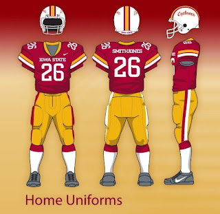
Again, call me a contrarian, but I actually like this look. I think it makes a pleasing and efficient use of our three colors there -- cardinal, gold, white -- and has just the right amount of white in the jerseys and pants to balance out the bright white of the helmet.
As others have noted, our current I-State logo just looks the best on a white background, which means I think we need to adapt the rest of the look to having white helmets be a pretty constant part of the kit. The road uniforms do that well; now for the home ones.
What you see above is bacially Wyoming's uniform, only with cardinal instead of brown...

...which I have always thought is a pretty good, unique, distinct look.
Doing the white helmet on our current jerseys without the white pants (the Texas Tech look last year) would look very imbalance, but if we had more white elements in our home jerseys, which everybody seems to like the idea of, I think it could go very well.
I thought the logo looked a little more flashy than usual? Was it a 'chrome' decal?
I think the logo sticker they use for the white helmets is different (true gold lettering) than for the cardinal helmets. Just like the "pointy" helmet stripe.
I agree it pops nicely, and liked it better this time without the center stripe - with that the gold clearly clashes with the yellow of the uniforms
(Ex from 2016 vs TexasTech)

Last edited:
upon seeing oklahoma's look on saturday i couldn't help but wonder what we may look like in something similar. not a fan of the wide collar, i must say. View attachment 50613
agree - hope we avoid the scourge of nike's wide collar with contrasting color
Anyone see these?
Screams arena league to me, but what do I know? I guess kids dig ugly where you can't even tell what team it is.
Anyone see these?
I like that uniform, but the gator logo doesn't go with the helmet at all. They should've done the UF lettering on the helmet instead.
Anyone see these?
i would like them more if the pants matched the jersey pattern.