Better or worse than the Bugle helmet?

Rate Willie (no ties allowed!)

  • Better

    Votes: 226 81.9%
  • Worse

    Votes: 50 18.1%

  • Total voters
    276

t-noah

Well-Known Member
Feb 2, 2007
19,780
13,417
113
I like the concept but that cat looks like he got a surprise finger in the ass.
Haha! You do have a way with words! :D

Sorry, I didn't mean to imply that you expected it.
No apology needed. I didn't intend to imply that you implied it. :)
I get the implication...
Get a room? Haha! :)

It's still used occasionally. Saw it on the board during recent volleyball matches. Also, it used at every home wrestling meet I attended last year.
True. And they were using them for helmet award stickers there for a while. What year did they stop doing that? Last year or the year before?
 
Last edited:
  • Friendly
Reactions: VeloClone

t-noah

Well-Known Member
Feb 2, 2007
19,780
13,417
113
I'm glad you showed what you were talking about. I would get behind that.

But for the record that isn't even close to the Heisman pose.

I would also like leaning Cy at some point. Maybe too laid back for a helmet, but damn, that logo is the best.
672090900777_670x.jpg

We have so many good Cy logos and the current one (bucky cy) is the worst of the bunch.
Here's the other.
a1 1.1 A 1983CyLeaningOn I.png a1 1.1 A 1983CyLeaningOn I ISU.jpg
 
  • Like
Reactions: NWICY

t-noah

Well-Known Member
Feb 2, 2007
19,780
13,417
113
I think they both suck. As a fan I have never understood why we have no true identity logo wise. Maybe our identity is lack thereof‍♂️ 
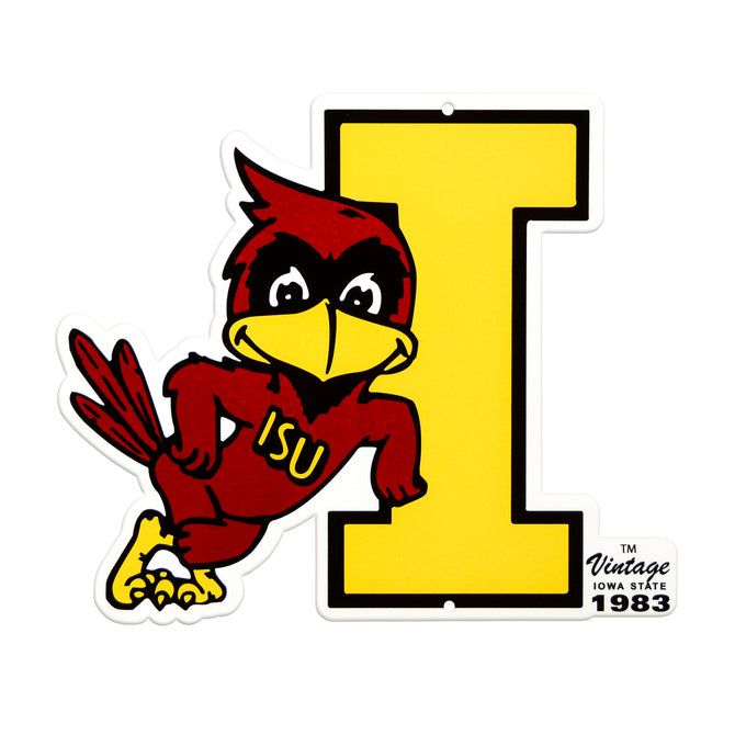
I mean I despise Iowa but their logo is timeless and they have stuck with it. You can say the same about K-State since Snyder, Oklahoma, Nebraska, Michigan, Texas, Tech, etc. then ISU, changing logos when we change coaches it seems like.
One of the big reasons Pollard procured and then has stuck with the primary I-State logo. And he will continue to stick with it while he is here. Rightfully so, I think. No need to change it now. [I do have some ideas to mod it].

But, as others have mentioned, I think the time has come to spice it up a little, add a couple of secondary logos, or go to a vintage look from time to time, as an alternative.
 

t-noah

Well-Known Member
Feb 2, 2007
19,780
13,417
113
I just wish the short 'I' leaning Cy had his elbow on the 'I' rather than floating above it. Once I noticed that I can't unsee it.
The cool thing is that you can alter or slighly modify vintage logos as you see fit.

For example, @Kagavi came up with a very simple mod to the vintage Walking Cy. It is perfect really. And nothing with this Logo/mod really changed. It was just pieced together differently.
a1 1.1 A 1983CyLeaningOn I and OthersBest2 tnMod2 A+B+C=D.jpg a1 1.1 A 1983CyLeaningOn I and OthersBest1.jpg
 

SECyclone

Well-Known Member
SuperFanatic
SuperFanatic T2
Sep 29, 2011
2,728
3,140
113
Pella
That terrible bugle logo has never reappeared in football. Even the AD knows it was bad
 

surly

Well-Known Member
May 16, 2013
9,690
4,088
113
reservation lake, mn
@surly what's your take on the retro helmets?
I like the fact that coach Klieman is appealing to his athletes' alternate uniform need. I love the white pants and helmet. Not a fan of the cartoonish Willie but the flipside number is cool old school.

Willie was worn back in the day. K-State's war Willie was a sailor which wouldn't have been appropriate for tomorrow's Ft. Riley day uniform.

Generally, K-State fans feel as I do about this alternate look. Let the players have some fun with it. But don't screw up the traditionals.

file.php
 

BillBrasky4Cy

Well-Known Member
SuperFanatic
SuperFanatic T2
Dec 10, 2013
17,521
31,854
113
Our apparel needs an upgrade or rebranding. I don’t mind the black and what not but ISU gear is not cool unless you are 60+. Feels crappy saying it but we’ve now been passed up by K-State

Don't buy Nike stuff.... There is a ton of really cool Iowa State gear out there that utilize retro logos.
 

Farnsworth

Well-Known Member
Apr 11, 2006
17,368
5,864
113
Des Moines, IA
The cool thing is that you can alter or slighly modify vintage logos as you see fit.

For example, @Kagavi came up with a very simple mod to the vintage Walking Cy. It is perfect really. And nothing with this Logo/mod really changed. It was just pieced together differently.
View attachment 103188 View attachment 103189

Here I would do version C without the shoes, keep the bigger front facing eye, but bigger black outline around it like B or D.

With D I don't like the even bigger eyes and centered pupil and closed mouth, or the giant **** pointing to his head.
 

JP4CY

Lord, beer me strength.
Staff member
SuperFanatic
SuperFanatic T2
Dec 19, 2008
74,720
95,813
113
Testifying
I like the fact that coach Klieman is appealing to his athletes' alternate uniform need. I love the white pants and helmet. Not a fan of the cartoonish Willie but the flipside number is cool old school.

Willie was worn back in the day. K-State's war Willie was a sailor which wouldn't have been appropriate for tomorrow's Ft. Riley day uniform.

Generally, K-State fans feel as I do about this alternate look. Let the players have some fun with it. But don't screw up the traditionals.

file.php
That's a solid retro logo.
 
  • Like
Reactions: surly

AuH2O

Well-Known Member
Sep 7, 2013
13,037
21,020
113
ISU still needs to get a cyclone logo that is immediately distinguished in a monochrome.